
Part 8 of a series on the NBA’s fading home court advantage; start with Home Court Advantage Is Fading.
An explanation can fit the games it was built from and still be wrong. I asked this one to predict seasons it had never seen. It caught the 2021 dip that a straight-line trend missed. That is one reason I trust the four-factor account of the decline: shooting, rebounding, turnovers, and fouls. The other checks here tried to break the case in different ways, and a few made it less tidy.
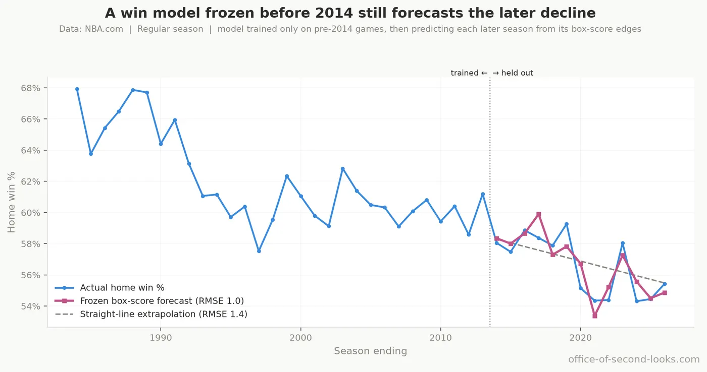
Why that prediction matters. A fair worry about any after-the-fact story is that it was fit to the whole history, so of course it lines up. To test that, a win model using those four factors was trained only on seasons through 2013, then used unchanged to predict each later season’s home win rate. Its error on seasons it had never seen is about 1 percentage point in the regular season, well under the 1.45 of a straight-line extrapolation and against more than 5 for a flat guess. The same frozen model beats both baselines in the playoffs too, though on a fifteenth as many games it comes much closer on the playoff level than on how steeply it fell. The explanation predicts data it was not built from.
📊 Actual playoff home win % across all seasons with the forecast from the four factors and…

The decline was re-fit every way the defensible choices allow. Every analysis makes calls that could have gone otherwise: where to start the clock, which model to fit, what to do with the pandemic seasons. So the regular-season slope was re-estimated under every combination of those three, 12 fits in all, and every single one still shows a decline. They run from -0.25 to -0.16 points of home win rate per year, around a median of -0.23. Only one of the three calls moves the number much. Starting the clock in 1995 rather than 1984 clips off the steepest stretch of the fall and gives the shallowest slopes in the set. That is worth knowing when reading any single figure here, and it is also the point: no combination of these choices makes the decline go away.
The slowdown was dated two ways, and both agreed. The decline bent, gently, in the late 1990s, then kept drifting. A bend like that can be an illusion of where you draw the line, so it was located with two methods built on different math: one that checks every possible break year for the sharpest change, and one that weighs how many bends the record needs. Their single-bend answers match: 1999, inside a range of roughly 1992 to 2003. A third check, one that watches the trend for drift as seasons pile up, never flags a break, which is what a gentle bend rather than a sudden jump would look like: that check is built to catch level jumps and has little power against a slope that merely eases. When independent methods agree, the slowdown is in the data, not in the choice of line; exactly when it came is less firm, as the next paragraph shows.
The second method has one more thing to say, and it complicates the picture rather than tidying it. Offered up to three bends, it does not think one is enough: a single bend gets only 19.3% of its confidence, with almost all of the rest going to two or three. Both of those richer fits then put their most recent bend in the same season, the one ending in 2020, when the pandemic cut the schedule short and finished the playoffs on a neutral floor. Hold that one loosely, and hold the single-bend year loosely too: neither richer fit’s earlier break lands on it either, so agreement on 1999 depends on restricting the model to one bend. The pandemic seasons are unlike anything else in four decades of the record, and a method hunting for bends will find one at a stretch that strange whether or not it marks a lasting change. The specification curve above is the answer to whether it matters: dropping those seasons outright barely moves the slope.
All of this is the regular season: each postseason rests on so few games that the break test cannot single out a year in it at all. This is the shape Home Court Advantage Is Fading describes.
Fake rule changes were planted where nothing happened. A favorite way to fool yourself is to find an effect at a moment when nothing actually changed. So the same test was re-run at every year from 1987 to 2010, to see whether the method would invent an effect where the story says there was none. It does: in the regular season the scan flags a run of drops at every boundary from 1990 through 1995 and a run of rises from 2002 through 2009. So a single-year step test cannot isolate 1994–95 or say what caused the later run. Next, group seasons by the NBA’s major rule changes and compare their home win rates with the long decline. That comparison suggests a dip of about 2.6 points in the mid-1990s and a rise of about 2.6 points in the early 2000s. The standard check finds each move clear; a stricter one leaves room for season-to-season swings. Together, the rule periods tell us something the steady decline misses, but they do not single out one rule or tell us exactly when the dip began and ended. The playoffs show no clear shift around those rule changes. That is the limited timing evidence Home Court Advantage Is Fading and The Usual Suspects use.
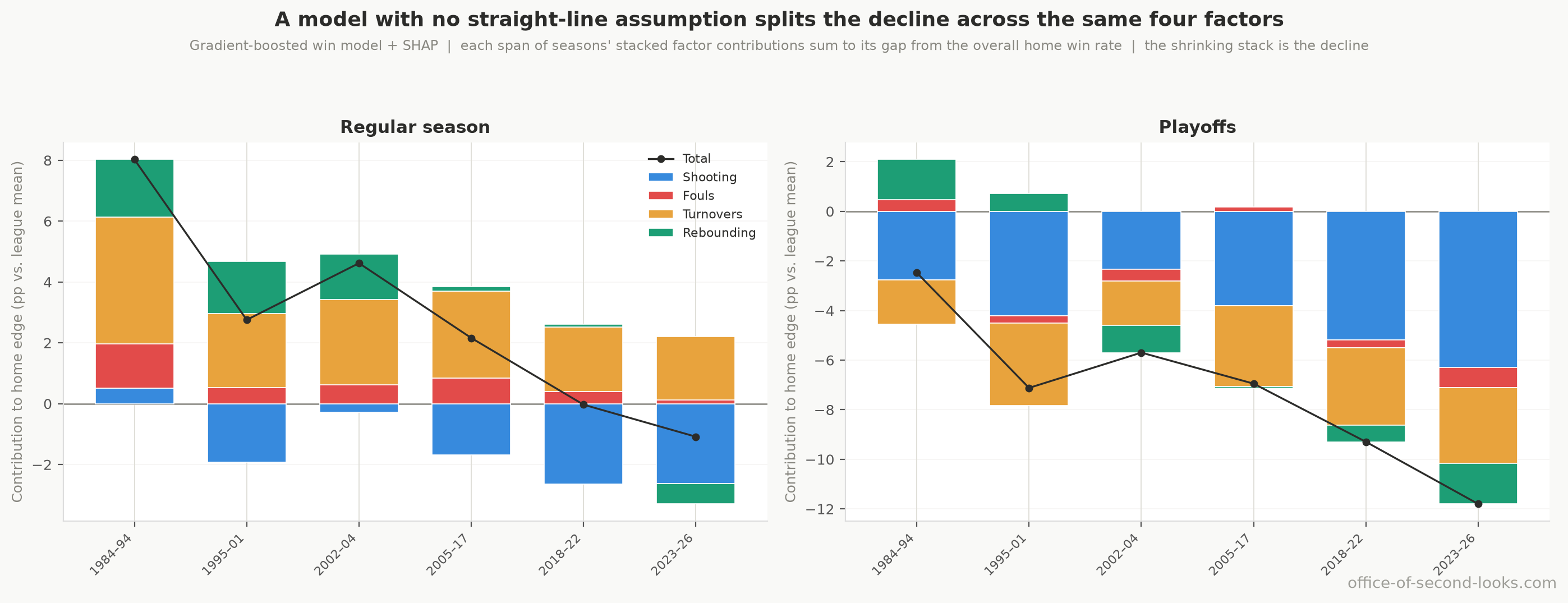
The breakdown held up under a very different model. The split of the decline across the four factors, the one The Three-Point Suspect lays out, comes from a simple model that just adds the four together. Would a method that does not require them to add up so neatly split the decline differently? A flexible model, one that lets the factors bend and interact instead of adding up cleanly, re-split the same decline, and it agreed on three of the four: rebounding, turnovers, and fouls all came out within a few points of their earlier shares. That is a consistency check the breakdown passed, not a second, independent measurement: both methods read the same four factors off the same games, so they can agree without either one confirming the other. Shooting is the one they split on: the flexible model gives it 34% of the decline against 21% before, which puts shooting at the top of its own ranking. The two rankings don’t really conflict: the extra credit it hands shooting is credit for a fade the rise in threes already explains. Rebounding is the largest piece in the simple breakdown, with a decline the rise in threes barely accounts for, as The Glass and the Turnover Gap explains. Between the two methods, the share to hold loosely is shooting’s. The playoffs are where the two methods disagree most: the flexible model puts shooting first at 38% of the decline, with rebounding close behind, where the simple breakdown gives shooting only 12% and can’t tell that share from zero. Both call rebounding large, and on a fifteenth as many games neither method’s share is pinned down.
📊 How a flexible win model splits the decline in home court advantage across shooting,…
How often did rebounding come out first? Rebounding is the largest single piece of the decline in the original breakdown, but that ranking may shift if different seasons are sampled. So the whole breakdown was re-run on many re-drawn sets of seasons, counting which of the four factors came out on top each time. Rebounding comes first in 76% of those redraws, turnovers in 21%, and shooting, which the flexible model ranks first, in just 2%. In the playoffs, on a fifteenth as many games, rebounding leads 64% of them. In the regular season, then, rebounding usually comes out first, but not by a runaway: roughly one redraw in four puts a different factor first, usually turnovers, the one The Glass and the Turnover Gap treats as rebounding’s near-equal.
Could an unmeasured cause explain the box-score links? Maybe one of the four factors is standing in for something the box score never recorded. There is a standard way to ask how strong such a hidden cause would have to be to explain a link away. For the shooting link that The Three-Point Suspect rests on, a hidden cause would have to explain at least 60.5% of everything left unexplained in both the home shooting edge and who wins; for turnovers, at least 40.7%; for rebounding, at least 36.8%; for the foul link, the lowest of the four, at least 28.9%. Those are demanding thresholds, so the strongest links are hard to wish away.
A season-to-season test gave the three-point explanation no help. If the move to the arc were pushing home court advantage down season by season, then one season’s three-point rate might help predict the next season’s home win rate. It doesn’t. Across 42 year-over-year changes in the regular season, last season’s three-point rate adds nothing to a forecast of this season’s home win rate beyond what the home win rate’s own history already supplies. It is also weak evidence, and for a reason worth naming: four decades give only a few dozen seasons, which is a very short series for a test of this kind, so it cannot tell “no effect” apart from “not enough seasons to see one.” The three-point case does not rest on it either way. That case rests on comparing high-three-point games against low-three-point games from the same seasons, tens of thousands of them, rather than one dot per season.
Many tests, one correction. Test enough things and a few will look real by chance alone. After allowing for all the tests we ran, the central results still stand: both decline trends, the link with three-point shooting among games from the same seasons, the regular-season rest and altitude advantages, and the finding that one steady slide misses part of the rules-period pattern. What drops out is what this series already treats as too small or too unclear to lean on: time zones, pace, playoff rest, and the playoff rule-change test. The central findings are not the lucky few.
It wasn’t a quirk of which franchises were in the league. The decline could be a trick of composition: franchises with unusually strong home records might simply have made up more of the league in the early years, rather than the edge shrinking league-wide. Even when the model is told exactly which teams are playing (home and away team identity), the decline barely moves: the biggest change to the estimated home advantage of any period is 0.5 pp. It is not an artifact of which franchises were in the league in which decade, which is why the fade reads as league-wide rather than the work of a few franchises.
None of these checks proves a mechanism on its own, and where the data can only propose a cause, these articles say so. What they establish is that the decline is real, its regular-season slowdown is real, though exactly where to date it depends on how many bends the model is allowed, and the four factors are not artifacts of how the numbers were sliced. For every test above with its full numbers and the range each result could shift within, see The Investigation.
That closes the case.
Back to the series hub: The Disappearing Home-Court Advantage
Data: NBA.com Stats, pulled with the open-source nba_api tool; attendance records from Basketball-Reference.