Part 3 of a series on the NBA’s fading home-court advantage; start with Home Court Advantage Is Fading.
The three-pointer is everyone’s prime suspect in the fall of home court advantage. How much of that fall can the three-point revolution actually account for? Put the league’s rising three-point volume next to the falling home win rate, down from about 65% to 55% of regular-season games over four decades, and the 40-year chart looks obvious: two lines that are near mirror images, one climbing as the other slides. The three-point shift reaches close to half of the home-court decline, and it still isn’t the whole story.

The decline shows up in four box-score factors, the same four that make up home court advantage in the first place: shooting, rebounding, foul calls, and turnover margin. The move to the three-point line runs through three of them.
| Box-score factor | Share of the decline | What changed in the real world | Is that cause proven? |
|---|---|---|---|
| Rebounding (largest) | ~30% | Home teams stopped crashing the offensive glass harder than visitors | Proposed. The data shows the pullback happened; it can’t say why |
| Turnovers | ~27% | About half the move to three-point shooting; the rest road-specific, with road teams closing the whole turnover gap from 0.85 to 0.13 per 100 | Mixed. The three-point half is measured directly; the road-side closure is measured too, but why road teams improved isn’t |
| Shooting (eFG%) | ~21% | The move to three-point shooting | Fully absorbed. Compare games at the same three-point rate and no separate shooting story is left |
| Fouls and free throws | ~18% | About half the move to three-point shooting; the rest a home foul edge that shrank and evened out across eras | Mixed. The three-point half is measured directly; the foul edge measurably shrank, but that it reflects fairer officiating is the read, not a separate test |
Three-point shooting runs through three of those four rows, which is how it reaches close to half the decline even though its own factor, shooting, is only about a fifth. That is the trap worth naming: the three-point shift reaches further than the other traceable real-world change, the officiating fade, but the biggest single row on the stat sheet, on the straight-line breakdown, is rebounding, the one row it barely touches, and almost none of that traces to the perimeter shift. That row gets its own piece: The Mystery on the Glass.
The obvious evidence isn’t as strong as we assume
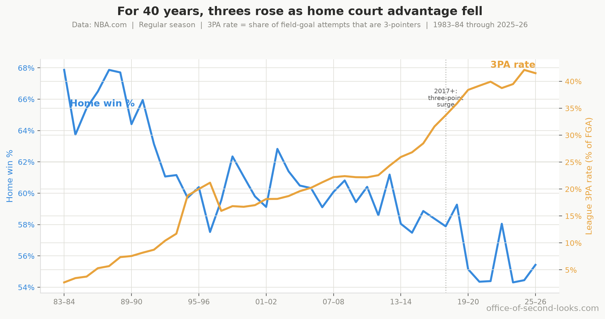
That chart looks like proof that the three-point shift and the home-court decline are related, but it’s weak evidence. The league’s three-point attempt rate and the home win rate have moved in opposite directions for 40 years. When fewer than 7% of shots were threes in the mid-80s and early 90s, home teams won 65%; when 40% are threes today, they win 55%. The timing even lines up with the recent slide, when the three-point share rose from about a quarter to 40% of all shots in the seasons after 2017.
It is tempting to read that chart as three-point shooting causing the decline, but the same 40 years changed almost everything else about the NBA too: training, scouting, salaries, the size and skill of the players. Anything that drifted steadily up over those decades will trace a near-mirror-image of anything that drifted steadily down, whether or not the two are related at all. So the 40-year chart, on its own, is weak evidence.
📊 Scatter of one season per point, regular season and playoffs, era-colored: the same…
One way to check it: set aside the slow drift in both lines and look only at the year-to-year bumps, the seasons where threes rose more or less than their long trend. If threes were really pushing the advantage down, those bumps should line up too. They partly do, but the link is about 42% weaker than the raw mirror image looked: much of what made the chart so striking was just the two trends sliding past each other in step.
A second check is blunter, and it is the reason the mirror-image chart gets retired here rather than merely discounted. Two lines that are genuinely tied together drift apart and then come back; two lines that merely happen to be sloping the same way wander off and never return. There is a standard test for which of those you have, and these two series show no sign of the tied-together kind: it finds no stable long-run relationship between them. Whatever the 40-year chart is showing, it is not evidence on its own, and everything below leans on comparisons made inside a single era instead. One more check leans the other way on purpose: a year-by-year test asking whether a season’s three-point rate forecasts the next season’s home-court advantage comes back null too, and it is reported here rather than left out, because a case that only lists the tests that passed isn’t a case.
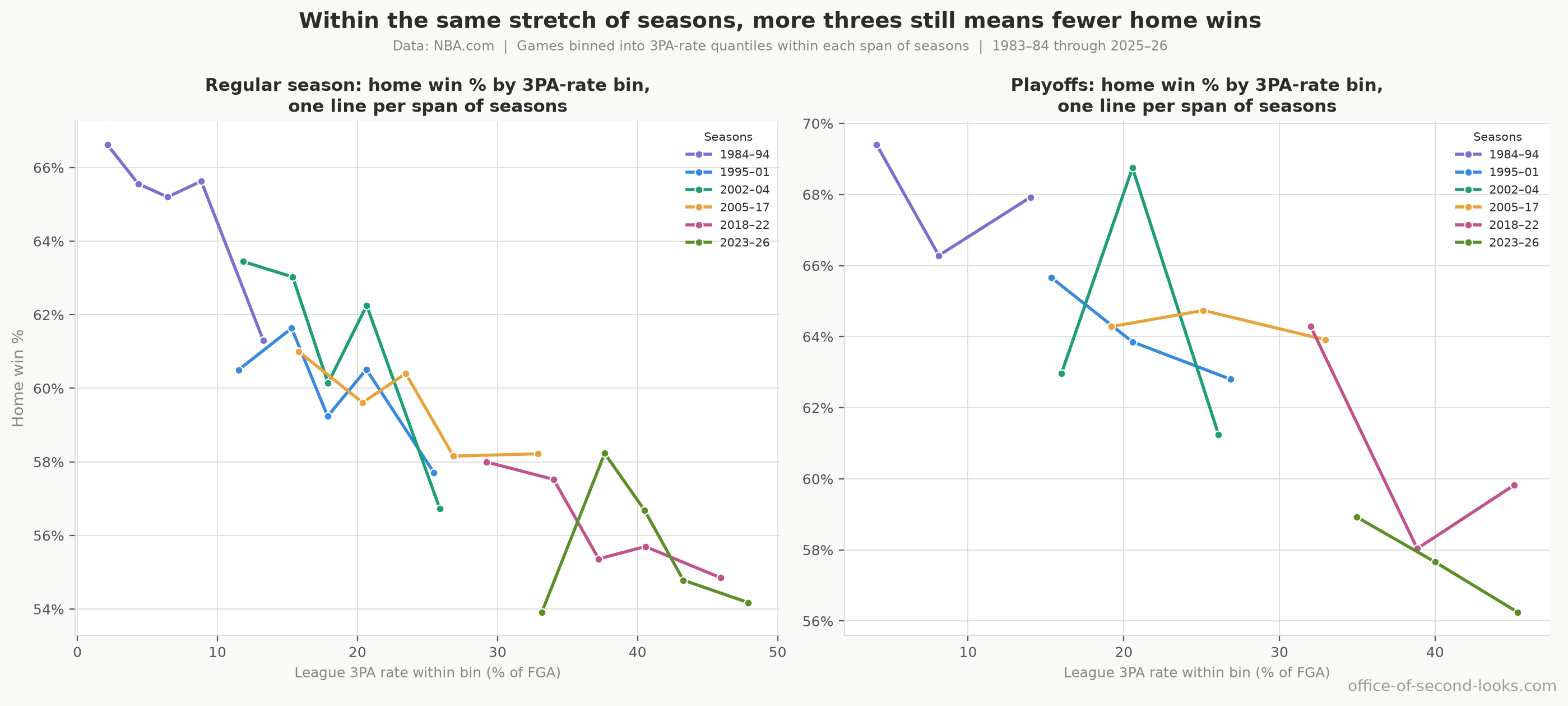
The clean evidence comes from a comparison the 40-year chart can’t make: high-three-point games against low-three-point games from inside the same rules era, not spread across the full 40 years. An era still spans years, not days, so some drift remains inside one, but nowhere near the 40-year sweep’s worth, and rules, rosters, and general style hold far steadier across a single era than across four decades. There, the high-three-point games are still the ones home teams lose more often: about 2 fewer home wins per 100 games in the regular season for every 10-point rise in three-point volume, and about 3 in the playoffs.
📊 Games binned by 3PA rate within each rules era, not across the full 40 years, one line…
How one shift touches three factors
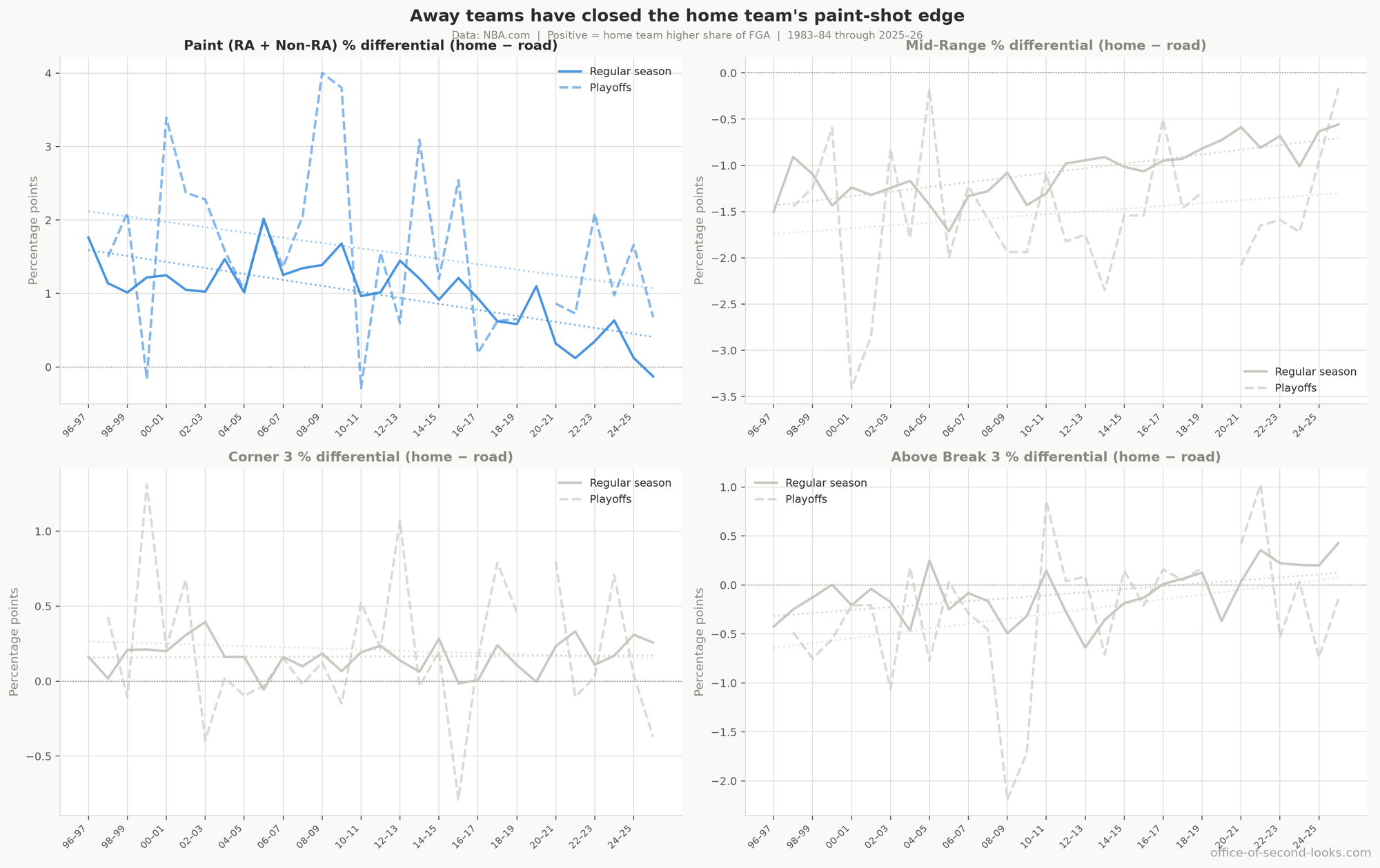
The perimeter shift reshaped shot selection, not just shooting percentages. The story starts in the paint. Away teams have closed the gap in paint attempts: in the late 1990s home teams generated about 1.3 percentage points more of their attempts from close range than road teams; in the most recent seasons that gap has shrunk to 0.2 points. A paint shot is more efficient than a mid-range jumper, so home teams once started each possession with a small built-in scoring advantage; that gap eroded steadily as the three-point share climbed, the same shape as the shooting story next door. In games with similar three-point rates the home shooting advantage shows no decline at all, and the paint gap closing plausibly reflects the same rise in three-point volume rather than a separate cause, though, unlike the shooting gap, it isn’t isolated by a same-three-point-rate test. In the playoffs the paint gap narrowed in the late 2010s but has since rebounded toward its old level, making this a regular-season story for now.
📊 Shot zone differentials (home minus road) over time, regular season vs. playoffs. Four…
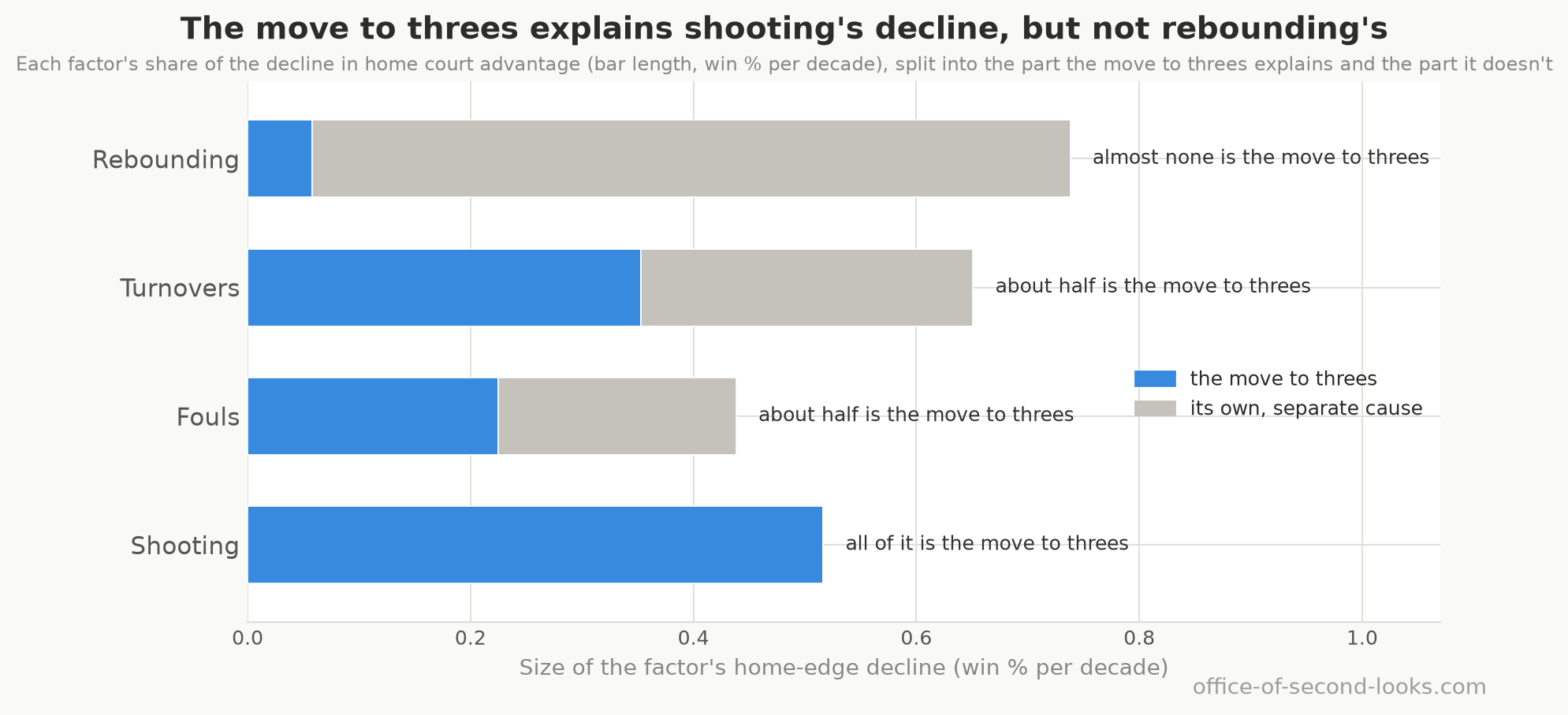
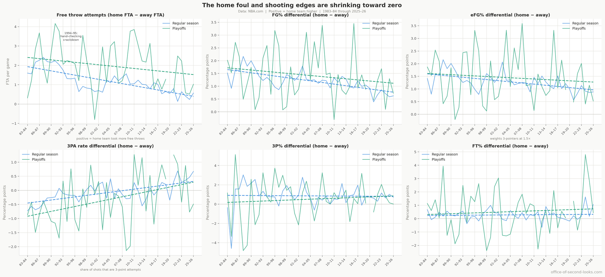
That within-season effect lands most directly in one box-score line: shooting. It accounts for roughly one-fifth of the regular-season decline. But the perimeter shift reaches past that one factor. It explains about half of the foul decline: the plausible reading is that three-point attempts draw fewer fouls than drives to the basket, so as both teams moved out there were fewer calls tilted the home team’s way to begin with, though the box score can’t confirm that mechanism directly, only the size of the absorption. It explains about half of the turnover decline for a parallel, similarly unconfirmed reason: arc attempts plausibly generate fewer live-ball turnovers than drives and post play. Add those in and three-point shooting touches close to half the decline overall.
📊 Home minus away differentials over time: free throw attempts per game (the whistle’s…
What it explains, and what it doesn’t
Step back to the original assumption: that the three-pointer explains all of it. Could rebounding and turnovers just be the three-point shift in disguise? No. Compare games at the same three-point rate and the shooting decline disappears entirely: there is no separate shooting story left to explain. The rebounding decline barely moves and stays the surest of the four. Fouls and turnovers each land in between: roughly half of each factor’s trend is explained by rising three-point volume, leaving the other half separate from the perimeter shift. The factors doing the most work to drag the advantage down, rebounding and the part of turnovers separate from threes, are doing it for reasons the three-point boom does not explain.
In the playoffs the same comparison is too thin on games to read clearly; only the rebounding decline clears the bar, so this is a regular-season verdict.
📊 Each box-score factor’s regular-season home-court decline, drawn as one bar whose length…
An independent check
Sparkle Technologies published its own analysis of the same question. Where the two pipelines share a number, they agree on the big picture: the overall decline, the foul-call story, and travel and pace being too small to matter. Sparkle’s home-court figures for the two altitude teams, Denver and Utah, land close to mine, a sign both pipelines are measuring the same thing.
Where they differ is instructive, and it is mostly about this suspect. Sparkle’s article names the three-point revolution as the primary cause, drawing on the same 40-year near-mirror image. I ran a tighter test and found about 42% of that lockstep is just two trends drifting the same way over time, not one causing the other. The three-point effect is real and shows up within individual seasons too; counting its share of the foul and turnover factors, it reaches close to half the decline, still short of the whole story. The factor Sparkle’s account never measures at all, rebounding, is the single largest and barely moves with the perimeter shift, and the fading turnover advantage adds more on top. Part of the gap is just how you count: the three-point shift is the most far-reaching real-world cause, touching three of the four box-score factors, but no single factor it drives is as large as rebounding, which has its own separate cause.
Two other places the accounts diverge are worth naming. Sparkle credited the schedule shift, fewer visitors arriving on a back-to-back, with 15 to 20% of the decline. The premise checks out: back-to-back frequency fell from about 35% to under 20%. The magnitude doesn’t: separating the schedule change from the rest puts its effect at roughly 8% of the decline, with the other 92% the home advantage shrinking within every rest situation alike. And the empty-arena numbers look different only because Sparkle’s single figure blends games with zero fans and games with partial crowds. Split apart, home teams won 51.0% with empty buildings and 58.5% with any crowd at all: an empty building costs nearly the whole advantage, while a bigger crowd shows no further effect the data can detect, so the two accounts aren’t really in conflict.
The rebounding decline is the biggest thing Sparkle’s piece leaves out, and it is the largest driver of all. That is the next article.
Next: The Mystery on the Glass. The single biggest driver of the decline turns out to be the one the data can measure and never quite explain.
Back to the series hub: The Disappearing Home-Court Advantage
How this was made: the writing here is mostly AI/LLMs working from my analysis and direction; the numbers are all Python on public NBA data. Every claim is backed up by data. The data, analysis, and conclusions are trustworthy. The full note is on the series hub.
Data: NBA.com Stats, pulled with the open-source nba_api tool; attendance records from Basketball-Reference.