
This document shows the tests behind home court advantage and its decline. It runs on the official NBA game logs: every regular-season and playoff game from 1983-84 through 2025-26, about 52,000 games in all, pulled from NBA.com’s public stats, and anyone can download them. A few tests run on a shorter stretch than that, and each one says so where it reports its result. Part 1 covers what actually drives home court advantage and its decline, and the evidence that each driver is real. Part 2 covers the explanations that sounded reasonable but did not survive a direct test.
How to read the numbers
Every test here carries two measures of how seriously to take it.
A p-value answers one question: under a specified model with no effect, how often would data at least this lopsided arise? It does not give the probability that the effect is real or that luck caused the observed result. The stars in the tables are the conventional thresholds:
| stars | p-value | rough meaning |
|---|---|---|
* |
< 0.05 | unusual under the no-effect model |
** |
< 0.01 | more unusual under that model |
*** |
< 0.001 | very unusual under that model |
| (none) | ≥ 0.05 | does not clear this evidence threshold |
A confidence interval (CI) is the more useful of the two, and the one to read first. A “95% CI” comes from a procedure that would contain the target in about 95% of comparable repeated samples, under its assumptions. For a result here, read the band as the range of values the available games do not rule out, not as a 95% probability that the fixed target sits inside this particular band. When I report the regular-season decline as -0.24 points per year, 95% CI [-0.29, -0.20], two things matter at once: the whole band is negative, so the decline is real, and the band is narrow, so its size is well pinned down. A “significant” result with a band of [+0.5, +20] is barely detected and wildly uncertain; the same star count with [+8.0, +8.4] is precisely measured. Same stars, very different findings.
One caution recurs throughout, and Part 2 has the clearest example. With about 52,000 games behind these tests, even a trivially small effect can clear the significance bar. A result can be statistically real and practically meaningless at the same time, so always check the size of the effect, not just the stars.
Part 1: What Drives Home Court Advantage
Home court advantage is real, it shows up in a few parts of the box score, and nearly all of its 40-year decline is those edges shrinking, at least in the regular season. Each section below states a claim, the test that checked it, what the data showed, and why the result holds up.
The Decline Is Real, Not Noise
The claim. The home team’s win rate has fallen by about 10 percentage points over four decades, in both the regular season and the playoffs.
The test. Fit a trend line through the season-by-season home win rate against the calendar year, regular season and playoffs separately. I fit it two ways: one model that weights each season by how many games it holds, and an ordinary trend line adjusted for the fact that one season’s result isn’t independent of the last. When two different methods agree, the finding doesn’t depend on the modeling choice.
What the data showed. Both methods land in the same place. The regular season falls about 0.24 points per year, 95% CI [-0.29, -0.20], p < 0.001, roughly a 10-point drop across 43 seasons. The calendar year alone accounts for about three-quarters of the season-to-season swing in home court advantage. The full-record playoff trend falls at a similar average rate: about 0.23 points per year, 95% CI [-0.37, -0.08], p = 0.002, roughly 9.5 points total. But the band is much wider and the scatter far greater: each playoff season is only about 80 games, so the year explains only about a fifth of the variation.
A note on scale, since the regular-season decline total recurs later in slightly different guises: this section’s 10-point figure is the trend line’s own total drop, while the box-score breakdown below measures the drop a different way, from the 1984–94 average to the 2023–26 average, where a second, more flexible model (below) accounts for about 9.1 pp of it. The two aren’t the same number restated; they measure the same decline two ways, and each is cited as-is where it comes from.
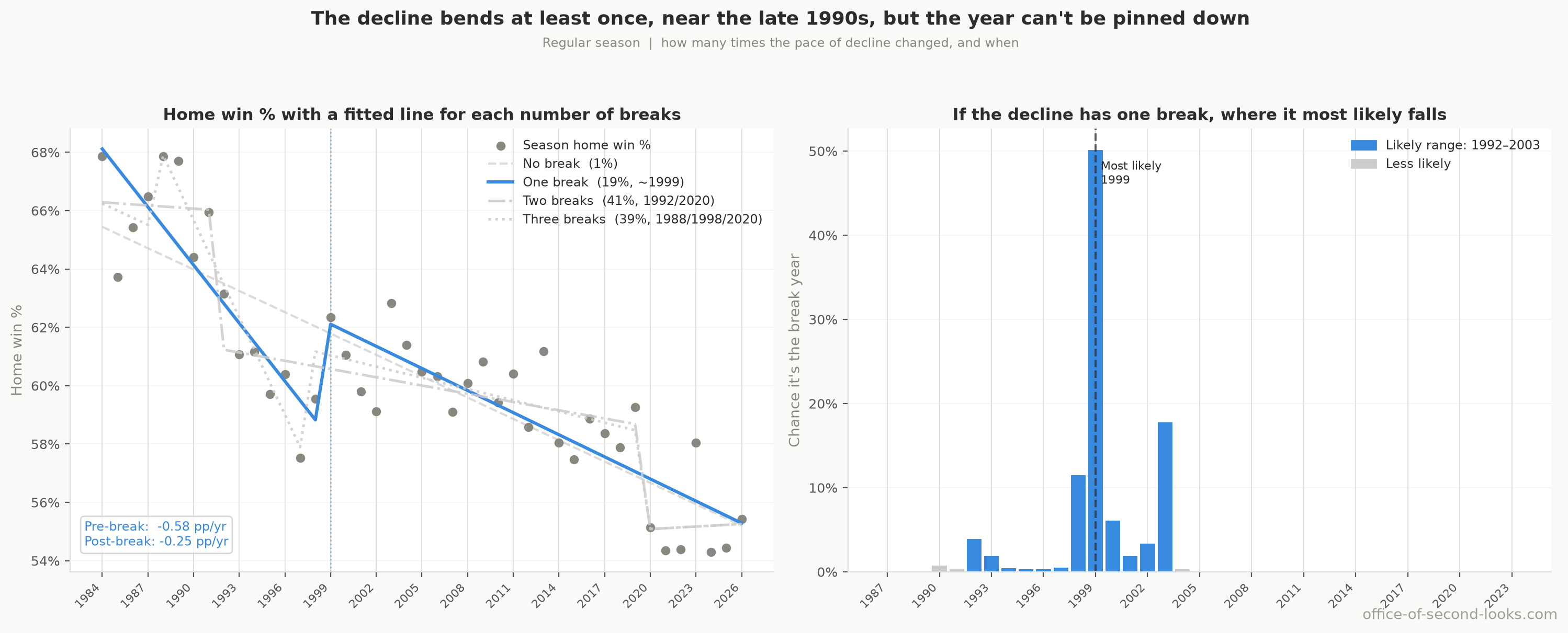
Why it holds. The whole confidence band is negative in both contexts, so this is not the random bounce of a few odd seasons. For the regular season, break-detection tests locate a bend in the late 1990s, when the decline slowed from about 0.6 points per year to about 0.25. It never durably reversed. They agree on that first bend, not on how many bends there are in total: the model that weighs the count gives a single bend only 19.3% of its confidence and prefers two or three. Its two- and three-bend fits both put their most recent one at the season ending 2020, the first pandemic season. Don’t lean on that late bend: those seasons are unlike any others in the record, and re-fitting the slope with them dropped barely moves it (the specification curve below). The regular-season figures rest on tens of thousands of games and are solid; the playoff figures share the same direction but, on far fewer games, pin down the size less precisely.
When did the playoffs fall? The full-record slope establishes a decline, but does not show that it happened at a constant pace.
| Seasons ending | Playoff home wins |
|---|---|
| 1984–94 | 67.9% |
| 1995–2001 | 64.1% |
| 2002–04 | 64.3% |
| 2005–17 | 64.3% |
| 2018–22 | 60.7% |
| 2023–26 | 57.6% |
Each row divides home wins by all playoff games in that period, excluding the neutral-site bubble. Answer: The observed averages show an earlier fall, a long middle plateau, and a further recent fall. The test searching for a playoff turning year finds no reliable break: its score is 3.23, below even the test’s 10% evidence threshold. The period boundaries organize the comparison; they do not establish when the decline began or changed pace.
It is league-wide, not a few fading franchises. Give each active franchise its own decline rate and the spread across them is all chance: 100% of the variation between teams is the random bounce of a short home schedule, leaving no detectable true difference. Strip that out and every active franchise with a long enough record collapses onto a single shared decline rate, and not one franchise’s edge is rising. The slide is not Sacramento or Phoenix handing back an old edge while the rest hold; it is the whole league drifting down together. Even when the model is told exactly which teams are hosting and which are visiting each game, the size of the drop barely changes (no period moves by more than 0.5 pp), so it is not an artifact of which franchises were in the league in which decade.
Where it is heading. A separate test asks what happens if the recent slope simply continues: let the underlying level drift forward and forecast the next five seasons, with intervals that widen the further out they reach. The central regular-season path falls from about 54.9% to 53.5% by 2031, 95% interval [48.4%, 58.6%]. The playoffs fall from about 58.8% to 57.1%, with a far wider 95% interval [44.9%, 69.3%] because each postseason holds so few games. The forecast is a what-if on the current trend, not a prediction about future rules; its value is that even the upper edge of the regular-season interval stays below where home court advantage stood in the mid-1980s.
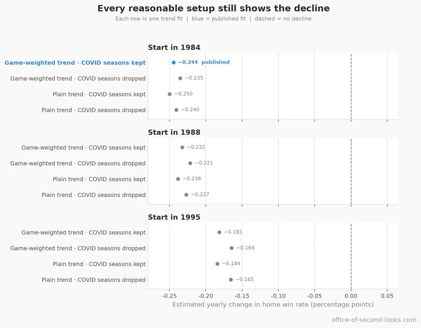
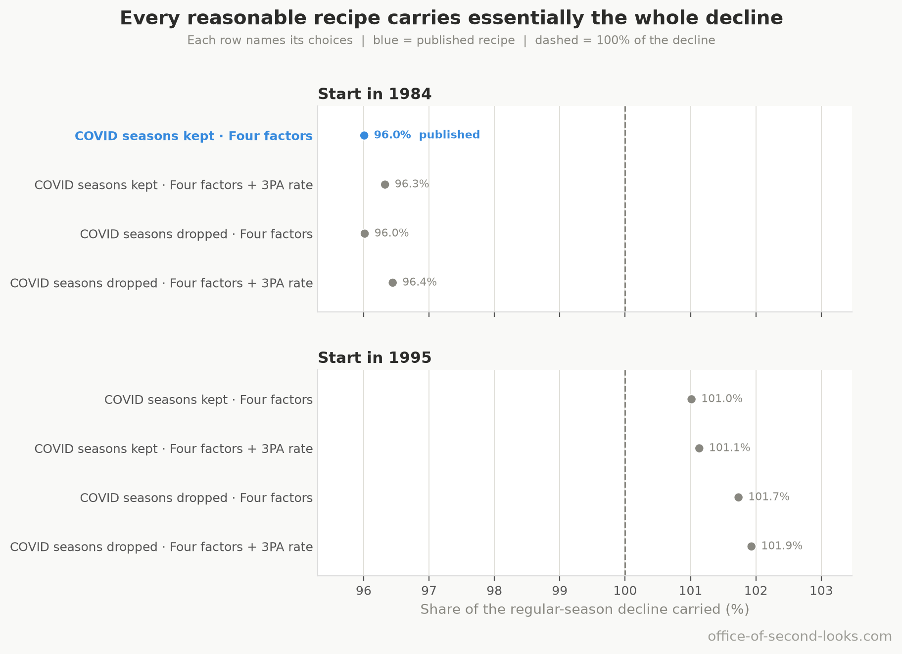
It survives every reasonable way of running the test. The real worry is not this one trend line but the ones I could have drawn instead: start the fit from a different season, swap the game-weighted model for a plain one, keep or drop the two odd COVID seasons. Re-fitting the regular-season slope under every combination of those three choices, 12 specifications in all, leaves it negative in every one, from a steep -0.25 to a shallow -0.16 points per year around a median of -0.23. The only choice that shifts it much is where the fit starts: begin in 1995 rather than 1983-84 and the slope shallows, because a 1995 start drops most of the steeper stretch that came before the late-1990s bend the break tests found. Not one specification points up, which is what “the decline is real, not an artifact of how I ran the numbers” looks like as a picture.
A Best-of-Seven Series Washes Out Most of the Home Edge
The claim. The per-game decline overstates the change in who wins a playoff series, because a best-of-seven dilutes a single-game edge.
The test. Take the home team’s one-game win rate for a period and play out 200,000 simulated best-of-seven series between two otherwise-equal teams, with the home-court side hosting Games 1, 2, 5, and 7 under the 2-2-1-1-1 format, then read off how often that side wins the series.
What the data showed. The format shrinks the fall along with the edge. From 1984 to 1994 a home team won about 65% of individual regular-season games, which turned into only a 55% chance of winning a series; by the 2020s the per-game rate had fallen to about 56% and the series advantage with it, to about 52%, 95% CI [51%, 52%]. The playoffs tell the same story a notch higher, a series advantage near 53% today, 95% CI [51%, 54%]. A 9.3-point drop in the regular-season per-game advantage shows up as only about a 3-point drop at the series level. The confidence bands come from propagating the per-game win rate’s own sampling range through the simulation, not from the Monte Carlo, whose error at 200,000 draws is a rounding detail; the regular-season bands are tight because the per-game rate rests on tens of thousands of games.
Why it holds, and two cautions. The dilution is a property of the format, not of the model: winning four of seven washes out most of a small single-game edge no matter how the simulation is tuned, leaving about a third of it in every period. What it dilutes is the edge itself, so the decline is cut to that same third and no more: the per-game and series edges fell by the same proportion, and a smaller series-level drop in percentage points is that rescaling rather than any shelter the format provides. The playoff per-game rate mixes the home edge with seeding, since better teams host more games, so the regular-season figures are the cleaner read on the home edge itself. And the simulation treats each game as a fresh start, unaffected by who won the ones before, so it shows how much the format dilutes an advantage rather than forecasting any real series.
The Playoffs: Seeding and Series Shape
The claim. The playoff decline is a real decline in home court advantage, not an artifact of seeding, and the postseason’s own structure (which team hosts which game) drives the pattern within a series.
The test. Three checks. Split playoff home games by whether the higher or lower seed is hosting, one period at a time, to find where the decline shows up. Model the playoff year-trend before and after stripping out the seed-quality gap (home minus away regular-season win rate), to ask whether the slide is just stronger seeds failing to dominate weaker ones. And break home win rate out by game number within a series (G1 through G7), which under the 2-2-1-1-1 format alternates who hosts.
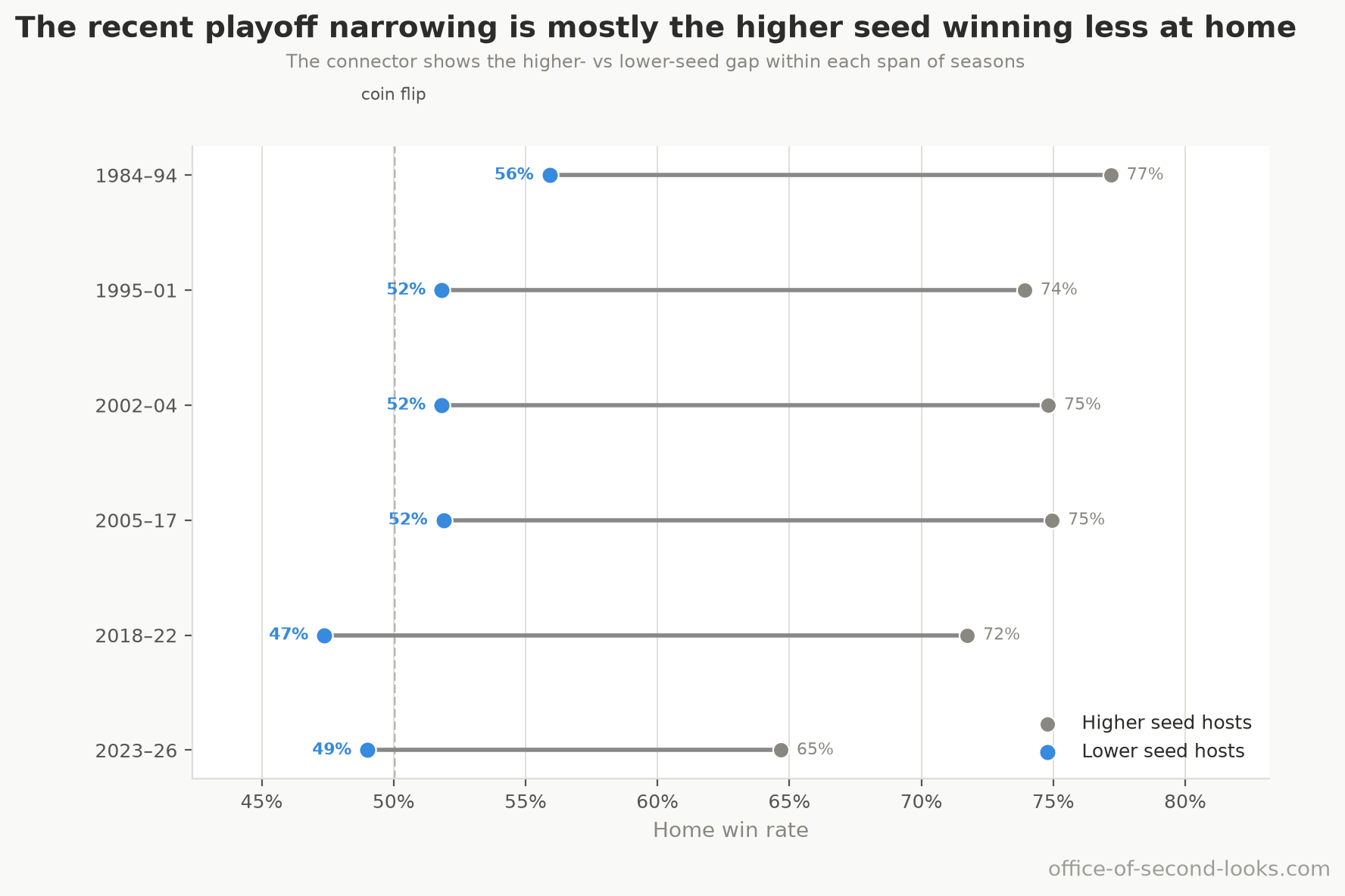
What the data showed. The higher seed has held a large home edge over the lower seed in every period, and only the last four postseasons show it narrowing. A lower seed hosting won 52–56% of its home games in 1984-2001, 21.3 pp below the higher seed’s own rate in 1984-94, and the gap stayed at 21–24 points in every period through 2022; in the last four postseasons it is 16 pp, with the higher seed’s home rate down to 65% and the lower seed’s at 49%. Most of that recent narrowing is the higher seed’s drop, more than twice the lower seed’s when each is measured against its own mean through 2022, but it rests on just four postseasons, fewer than two hundred home games per side. The lower seed’s home rate sat at 47–52% from the early 2000s through 2022 and is 49% now: a few points below its 1980s level, not a collapse. Stripping out the seed-quality gap does not explain the slide: the year-trend is essentially unchanged once that gap is removed (about 102% of it retained), so the postseason decline is a real decline in home court advantage, not the top seeds and their opponents becoming more evenly matched. The home edge itself is still large: between two equal-quality playoff teams the host wins a single game 14.0 percentage points above a coin flip, 95% CI [12.3, 15.7]. Even when the objectively weaker team hosts Games 3 and 4 it wins about 51.3%, 95% CI [48.5%, 54.2%]: a near coin flip, meaning the building roughly cancels its talent deficit. The series shape follows who hosts, not how deep the series has gone: home win rate swings between about 74% in the games the higher seed hosts (1, 2, 5 and 7 in most series) and about 52% in the ones the lower seed hosts (3, 4 and 6), a sawtooth far too sharp to be chance (p < 0.001 across game numbers; a test of this shape reports a significance level rather than a CI, and the game-by-game rates above are the effect sizes to read). Even Game 7 goes to the host about 72%, closer to Game 1’s 74% than to the 52% of the games the lower seed hosts, so road teams show no sign of adapting as a series wears on.
The regular season, for comparison. In the regular season the gap between a strong and a weak home team has narrowed across the whole record. The regular-season gap between a strong team’s home win rate and a weak team’s fell from 34.9 points in 1984-94 to 28.2 today, a shrinking the data confirms is real rather than a fluke (p < 0.001; the two figures above are the effect sizes, since this significance test carries no separate CI). The playoff gap held through 2022 and narrowed only in the last four postseasons, so whether the postseason is now following the regular season cannot be told from four postseasons of games.
What Home Court Advantage Is Made Of: The Four Factors
The claim. Home court advantage can be measured through the four factors: shooting, rebounding, turnovers, and fouls, with foul calls standing in for free throws. The test isn’t whether these factors matter, since they cover the main ways a possession can go right or wrong; it’s how much of the home advantage each one accounts for, and whether together they capture nearly all of it.
The test. A model of who wins each game from four home-minus-away differences: effective field goal percentage (eFG%), fouls (which carries the free-throw advantage), turnovers, and rebounds. The model then splits the home advantage into a contribution from each factor, with the four contributions summing to the whole. Re-running the model on repeatedly re-drawn samples puts a range on each share.
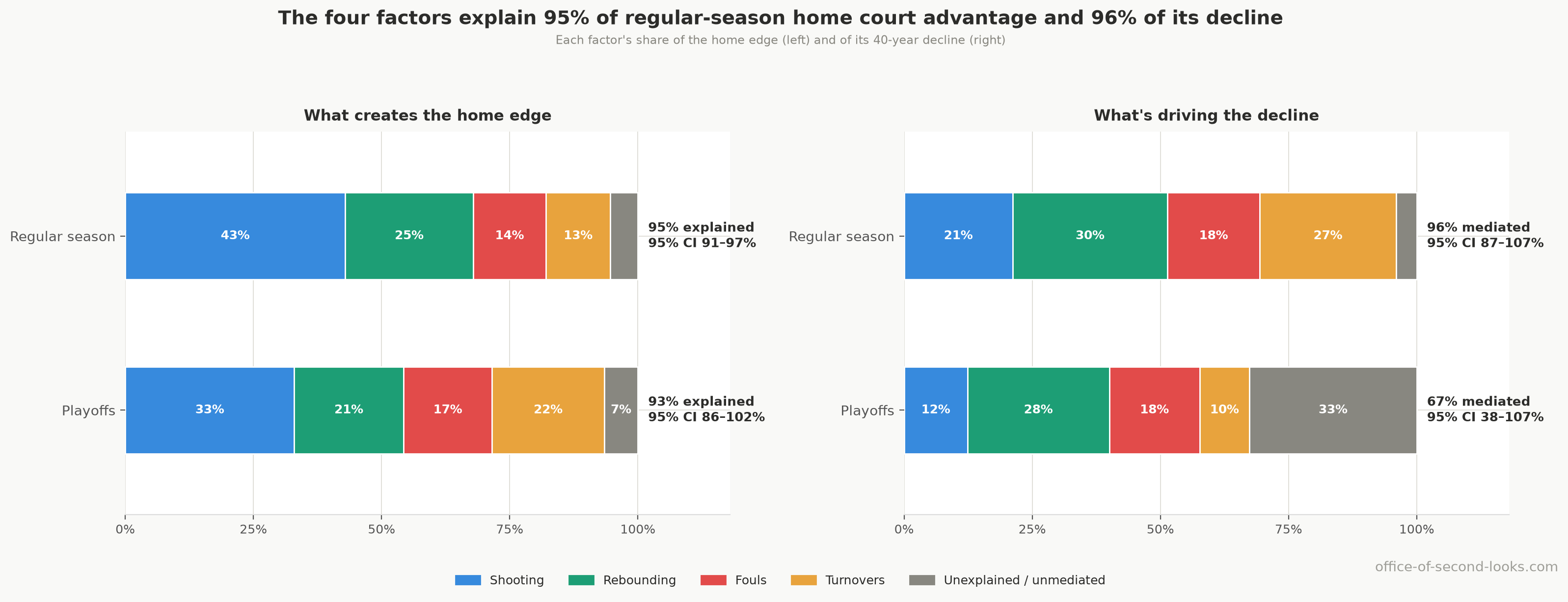
What the data showed. In the regular season the four factors account for 95% of the +10.1-point home advantage (home win probability above a coin flip), 95% CI [91, 97]%. Shooting is the largest single share at 43%, then rebounds at 25%, fouls at 14%, and turnovers at 13%; about 5% is left unexplained. The playoffs look much the same: the factors account for 93% of the larger +14.1-point advantage, 95% CI [86, 102]%, split across shooting (33%), turnovers (22%), rebounds (21%), and fouls (17%).
A note on scale: this win-model advantage counts home win probability above a 50% coin flip (the +10.1 points here). The “home minus road” gap cited later in this report and in the article series sizes the same edge a different way: a team’s own home win rate minus its own road rate. The league average of that gap, counting each qualifying franchise once, is 20 points.
Why it holds. The four factors rebuild the home advantage almost exactly in both contexts, and the regular-season bands are tight. The playoff shares are looser because each playoff season is small, and they fold in the fact that the home team is usually the better seed, but the breakdown of the advantage itself (as opposed to its decline) is solid. The next four sections take each factor that changed over time.
The Friendly Whistle Faded
The claim. Referees have always called fewer fouls on the home team, and that advantage has shrunk. The fading foul edge accounts for part of the decline.
The test. Averages for each period and a trend line on the home-minus-away foul differential and free-throw-attempt differential, regular season and playoffs. Then the share of the overall decline that the foul edge accounts for, from the four-factor breakdown above. Separately, every referee with at least 50 playoff games on record is checked for a home-favoring tilt, with a correction for the fact that testing 47 officials at once will throw up a couple of false positives by luck.
What the data showed. The regular-season home foul advantage went from 1.23 fewer fouls per game in 1984-94 to 0.25 in 2023-26, a trend of +0.022 per year, 95% CI [+0.017, +0.028], p < 0.001, a drop of about 80%. The free-throw advantage fell in step, from +1.97 attempts per game to +0.46. The playoffs moved the same way (1.58 fewer fouls down to 0.68, trend +0.020 per year, 95% CI [+0.007, +0.034], p < 0.01) but kept about 2.8 times the residual foul advantage of the regular season. The foul factor accounts for 18% of the regular-season decline, 95% CI [14, 22]%, and about 18% of the playoff decline. The tilt is nearly universal, not a few rogue officials: 45 of 47 playoff referees favor the home team, and 29 stand out on their own even after the correction for multiple testing.
Why it holds. The trend is significant in both the regular season and the playoffs. About half of the shrinking traces to the rise in threes rather than the officials: compare games with the same three-point rate and roughly half of the foul trend disappears, the same test the turnover edge passes below; the half that remains is a trend in the foul calls that the rise in threes can’t explain. At the 1994–95 boundary, the regular-season foul gap shows an immediate +0.44 fouls-per-game step (95% CI [+0.13, +0.74], p = 0.007), while the measured shooting, turnover, and rebound gaps show no detectable jump. That timing fits an officiating route, but the home-win step is borderline and the shorter three-point line began in the same season, so this pattern cannot identify the rule that caused the dip.
The Rise in Threes
The claim. As both teams moved their shots out to the three-point line, the home team’s shooting advantage shrank.
The test. The trap here is obvious: three-point shooting and home court advantage both trended hard for 40 years, so the two are guaranteed to move together, and that proves nothing. The real test compares games from the same period (the six periods happen to start at rule changes; what matters is that each is far shorter than the 40-year trend): among games played close in time, do the higher-three-point games show lower home win rates? If the relationship survives stripping out the shared 40-year trend, it is much more likely to be mechanical.
What the data showed. It survives. The same-seasons effect is -2.27 points of home win rate per 10 points of three-point rate, 95% CI [-3.08, -1.45], p < 0.001. That is only a little smaller than the unadjusted -2.64 (95% CI [-3.07, -2.20]), so stripping out the shared 40-year trend hardly changes it. The playoffs point the same way and, on the point estimate, harder (-3.12 per 10 points, 95% CI [-5.89, -0.36], p = 0.027), though on far fewer games the band is wide enough to cover the regular-season figure too. The home effective-field-goal advantage fell from about 1.6 points to roughly 1.0. And when games with the same three-point rate are compared, the home shooting trend vanishes entirely: the fading shooting advantage is the three-point story. Shooting accounts for 21% of the regular-season decline, 95% CI [11, 28]%.
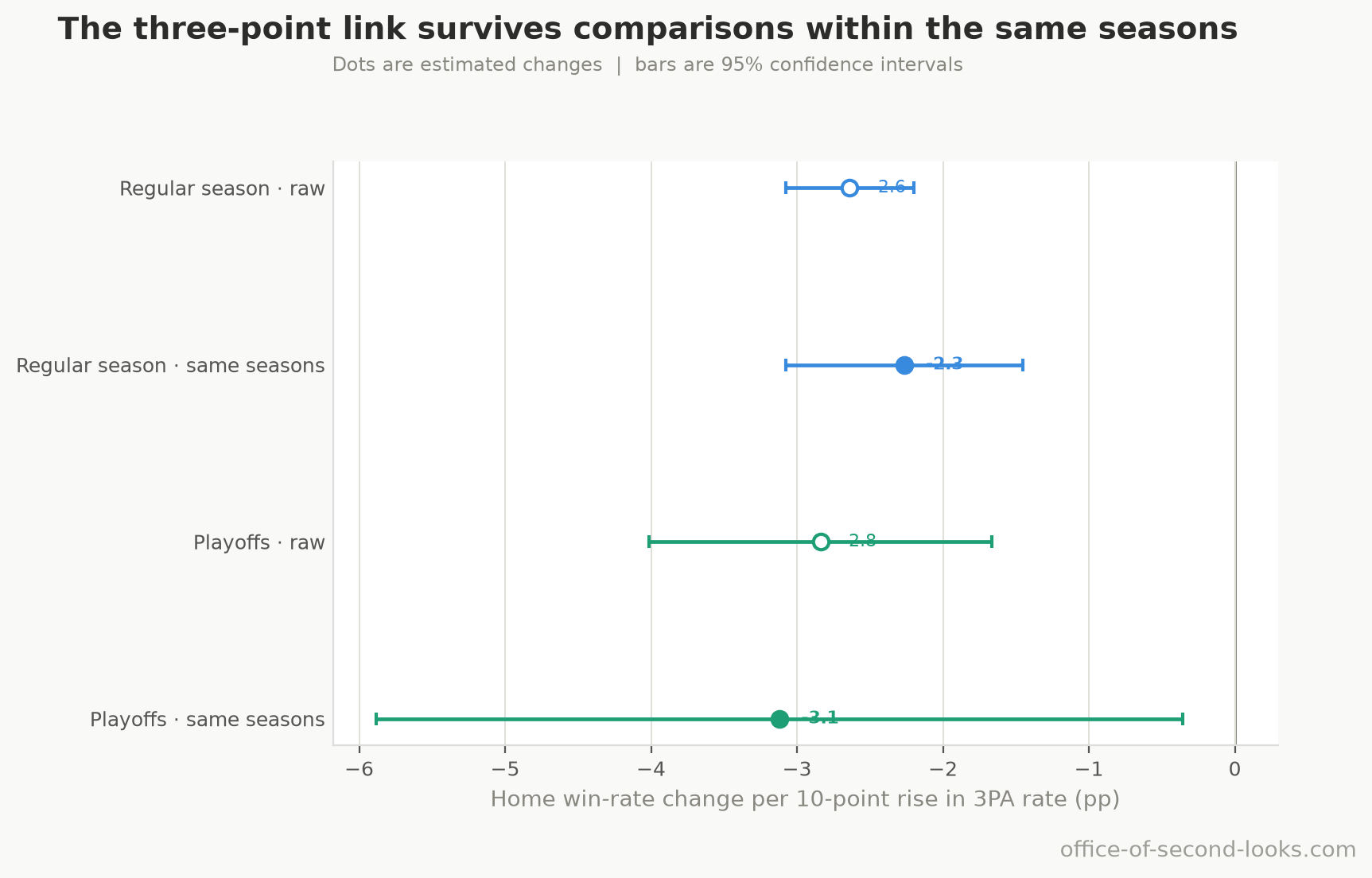
Why it holds. A check of whether that link is a genuine long-run tie or just two series trending across the same 40 years finds a good deal of drift in it: about 42% of the raw season-level association (about -0.90) is the two series sliding past each other over the decades, so the striking 40-year mirror image overstates the link. A formal version of the same question is harsher still: a test for whether the two series are tethered over the long run (p = 0.766, with no natural CI of its own) finds no such tie, so the season-level association carries no weight on its own. But the same-seasons, game-by-game effect is real and significant, and it points the same way in the playoffs. The most plausible mechanism is compositional: threes are taken from spots where home comfort and familiar rims matter less than they do on interior shots, so as both teams shifted outward, the home shooting advantage had less room to operate. One last guard against reading too much into the shared trend: a year-by-year test asks whether a season’s three-point rate forecasts the next season’s home court advantage, that is, whether the rise in threes runs ahead of the decline, and it finds nothing (p = 0.23 at one season’s lag, 0.27 at two; a test of this kind reports p-values rather than a CI). That negative result cuts against the three-point account rather than for it, and it is reported here for that reason; it is also a weak test, run on only 42 year-over-year changes, so it cannot separate “no lead” from “too few seasons to detect one.” The test finds no sign that the rise in threes runs ahead of the decline season to season; the link that carries the story is the game-by-game one within the same period, where home teams win less often in the higher-three-point games.
The Rebounding Collapse
The claim. The home rebounding advantage collapsed, and it is the single largest driver of the regular-season decline.
The test. Averages for each period and a trend line on the offensive, defensive, and total rebound differentials, plus a pace-free measure: the share of available offensive boards the home team grabs minus the away team’s share. Raw rebound counts rise and fall with pace and with how many shots miss, so the share is the clean measure of who actually controls the glass. Then a check of whether the rebounding fade is just downstream of the rise in threes.
What the data showed. The advantage collapsed. The regular-season offensive-rebound differential went from +0.61 per game to -0.05: home teams no longer out-rebound visitors at their own missed baskets at all. The pace-free share advantage collapsed roughly tenfold, from +2.14 points to +0.21, trend -0.052 per year, 95% CI [-0.060, -0.044], p < 0.001. Rebounding accounts for 30% of the regular-season decline, 95% CI [25, 38]%, the largest single factor. The playoffs show the same shape (share advantage +2.74 down to +0.70, trend -0.046 per year, 95% CI [-0.080, -0.011], p = 0.010), and rebounding accounts for 28% of the playoff decline.
How settled is “largest”? The four shares are estimates with overlapping intervals, so the ranking deserves its own test rather than a glance at the point estimates. Re-drawing the seasons and re-running the whole breakdown on each redraw, rebounding comes out the largest factor in 76% of them, turnovers in 21%, shooting in 2%, and fouls in 0%; in the playoffs rebounding leads 64%. The lead holds, and it is not settled beyond argument: the live rival is turnovers, not shooting, and the two together take the title in nearly every redraw.
Why it holds. Three things. The pace-free share metric collapses too, so this is not a side effect of the league playing faster or slower. It is independent of the rise in threes: comparing games with the same three-point rate removes only about 8% of the rebounding trend, and the trend holds up clearly in that comparison, so rebounding is a genuinely separate part of the decline. It also tracks the league-wide fall in the share of missed shots that offenses rebound. That last link is a season-level association (about +0.82) that the same long-run check flags as mostly parallel trend, so the conclusion rests on the rebounding evidence above (the share measure and the same-three-point-rate comparison), not on that raw number. One proposed explanation is that teams chose to get back on transition defense rather than chase second chances; the offensive-rebound rates don’t measure that choice. Modern player tracking covers fewer seasons but looks directly at the home edge in converting offensive-rebound chances. The home edge in converting available offensive boards is small and tilts downward (averaging +0.71 pp over the tracking years), and home teams hold no measurable box-out edge at all, consistent with much of the offensive-glass advantage having faded before the cameras arrived, with the rest still fading inside the tracking window. On a window this short none of the three tracking trends is individually established once all three are corrected for together, so the conversion trend is suggestive rather than established. Neither offensive-rebound rates nor box-out counts identify changes in effort or strategy.
The Turnover Edge
The claim. Home teams used to give the ball away less often than visitors, and that gap closed.
The test. The same averages by period and trend line on the home-minus-away turnover differential, plus its share of the overall decline and a check against the rise in threes.
What the data showed. In the regular season the turnover differential trends toward zero at +0.019 per year, 95% CI [+0.014, +0.024], p < 0.001. The turnover edge accounts for 27% of the decline, 95% CI [20, 34]%, second only to rebounding. Part of it is downstream of the rise in threes (about half the trend disappears when comparing games with the same three-point rate), but the rest survives that comparison. Part of what’s left is road-specific: road turnovers fell faster than home ones, cutting how many more turnovers road teams commit than home teams from 0.85 to 0.13 per 100 possessions, nearly erasing the home edge, so what stays open is why road teams improved, not whether they did. The playoffs are different: the turnover edge accounts for only about 10% of the playoff decline, and its trend there is not statistically clear, with a wide band.
Why it holds in the regular season, and the caveat for the playoffs. The regular-season trend is significant and survives the same-three-point-rate test, so it is a real part of the decline. The playoff turnover story is directional at best: the sample is small and the band runs from a large contribution to a small one pointing the other way. This is one of the places where the regular season is established and the playoffs only suggestive.
The four factors above, working together, capture 96% of the regular-season decline, 95% CI [87, 107]%. The playoff factors capture 67% of the playoff decline, 95% CI [38, 107]%, which leaves about a third of the postseason slide outside the measured box score and loosely pinned. The regular-season account is close to complete; the playoff account points the same way but leaves that third outside the box score, on far fewer games. Everything in Part 2 was tested against this account and added little or nothing to it.
And that near-complete share barely moves when you change the recipe. The 96% is one modeling path among several, so the same choices worth varying for the slope are worth varying here. Recomputing the factors’ share of the regular-season decline under every combination of start year, COVID handling, and whether the three-point rate joins as a fifth factor, 8 specifications in all, lands the share between 96% and 102%, a median of 99%. In every one the factors account for essentially all of the decline; the specifications that start in 1995 nudge just above 100%, which only means the tiny remainder the four factors don’t already explain can tip either way by chance. The conclusion that the decline runs through the box score, not around it, does not depend on the arbitrary choices.
One more check on the breakdown itself. The factor shares above come from a straight-line model. To see whether that assumption is doing the work, the same four edges were fed to a flexible win model that lets the factors bend and interact, which then splits each game’s outcome among them and reads off how much each factor’s edge shrank over the 40 years. It agrees closely on three of the four factors: rebounding and turnovers each account for a substantial share of the regular-season decline and fouls the smallest, about 15%, with the four shares together accounting for about 9.1 pp of the drop from 1984–94 to 2023–26. Shooting is the exception: the flexible model puts it at 34%, above the straight-line breakdown’s 21%, because shooting, fouls, and turnovers all track the rise in threes, and two methods can divide credit among co-trending factors differently while agreeing on the total. The playoffs are where the two methods diverge instead: the flexible model puts shooting at 38% of the playoff decline, where the straight-line breakdown gives it only 12% and can’t tell that share from zero, though both still rate rebounding large. That agreement on rebounding, turnovers, and fouls in the regular season is a consistency check the breakdown passed, not the independent corroboration it looks like: both methods read the same four box-score edges off the same games, so they can agree without either one confirming the other. The extra credit the flexible model hands shooting is credit for a decline the rise in threes fully explains, so the two rankings don’t really conflict: rebounding remains the largest driver with a cause of its own, and shooting’s share is the one to treat as approximate.
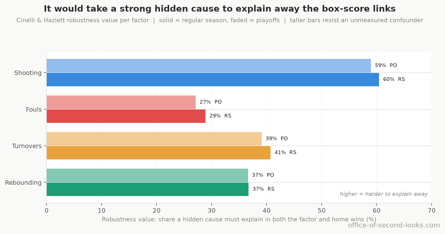
How fragile are these links to something the box score never measured? One standard check asks how big a hidden, unmeasured cause it would take to explain a factor’s link to winning away entirely: a cause linked to both that factor and who wins. To erase the foul link, such a cause would have to explain at least 28.9% of the leftover variation in both fouls and home wins, more than the share of that leftover variation in wins the foul factor itself explains (10.5%). For shooting the bar is higher still, 60.5% of the leftover variation. Those are demanding thresholds, so the foul and shooting links are hard to explain away with one omitted cause. This only bounds how robust the links are; it does not prove the factors cause home wins.
📊 For each factor, the share of leftover variation that one hidden cause would have to…
Correcting for running many tests. A report this size runs a battery of tests at once, and run enough tests and a few will clear the p < 0.05 bar by luck alone. After the standard correction for that, which caps the share of the flagged results that are chance flukes, across the primary tests, the two decline trends, the same-seasons three-point effect, regular-season rest, altitude, and the quasi-binomial joint test of the era levels still clear the bar; playoff rest, measured on series openers, does not. The only results that fall out are ones this report already treats as marginal or absent (time zones, pace, playoff rest, and the playoff joint era test), so the central findings are not the lucky few from a long list.
Does the breakdown predict a decline it never saw? The strongest test of whether this is the real machinery is to make it forecast blind. The four-factor win model was frozen on the seasons through 2013, then asked to call each later season’s home win rate from that season’s box-score edges alone, with no peek at the result. On the held-out seasons 2014–2026 it misses each season’s home win rate by about a point on average (0.95 percentage points in the regular season), beating both a flat guess (off by 5.48) and a naive extension of the early trend line (off by 1.45), and it even catches the 2021 dip the trend line sails past. The playoffs are noisier but point the same way: the factor model misses by 3.87 points against 7.30 for the trend line. A mechanism fit only on the earlier seasons that then reconstructs the later ones it was never shown is a stable one, not a story fitted to hindsight.
Part 2: What I Ruled Out
Several explanations for the decline are compelling on their face: the rules changed, travel improved, tired visitors became rarer, crowds thinned or grew quieter, more parity compressed outcomes. Each deserves a direct test rather than an assumption.
For each hypothesis below, I lay out why it seemed plausible, what was measured, what the data showed, and where the intuition went wrong. The charts here are the same ones used in the full analysis pipeline.
Rule Changes and the Era Labels
Why it seemed plausible. The NBA’s history splits into six labeled eras, divided by five rule changes: the hand-checking crackdown, zone legalization, the perimeter-hand-check ban, freedom-of-movement emphasis, the take-foul rule. It would be natural to read one or more of those transitions as explaining where home court advantage bent.
The test. I tested whether each rule-change year produced a one-time step in home win percentage on top of the ongoing slide, the kind of jump a trend alone would not predict.
The result. In this model, which holds each era flat, the mid-1990s level steps down 2.6 points from the 1984–94 level, beyond what the trend predicts, and steps back up 2.6 points at 2001–02. The 1994–95 step is borderline: its season-level quasi-binomial p = 0.030 and season-clustered p = 0.059, with 95% intervals [-4.9, -0.3] and [-5.3, +0.1] points. The 2001–02 return is borderline (quasi-binomial p = 0.039; season-clustered p = 0.102; 95% intervals [+0.1, +5.1] and [-0.8, +6.1] points). The later boundary verdicts are 2004–05: not detected, 2017–18: not detected, and 2022–23: not detected. The model’s era boundaries set the dip’s duration; these tests do not locate an exact start or end, or show that hand-checking caused it. The shortened three-point line began in 1994–95 too. In the playoffs, no era boundary shows a detectable step.
Is the decline a staircase or a smooth slope? A separate break-detection test asks a different question: not whether a specific boundary caused a step, but how many times the slope bent and when. It finds evidence for at least one gentle bend around the late 1990s, consistent with the hand-checking era, but it can’t pin the year within a decade, and on how many bends there are it prefers more than one, as Part 1 sets out. If the decline has a single bend, it most likely falls around 1999, with a likely range of 1992–2003. The long decline is mainly a drift, while the era model allows a temporary dip around the mid-1990s.
Why the intuition is incomplete. A rule can change play for both teams without changing the home–road gap. These era comparisons cannot isolate whether any particular rule changed that gap.
Hand-checking could matter through referee discretion: a change in how fouls are called can affect the home and away teams differently. The foul-gap model estimates a +0.44 fouls-per-game step at the 1994–95 boundary (95% CI [+0.13, +0.74], p = 0.007). Its timing is consistent with that route, but timing alone does not identify which rule caused the home-win dip.
One complication: the three-point line was also shortened in 1994-95 through 1996-97, and neither the season-level results nor the factor data can fully separate the two changes.
The practical implication: the era boundaries tell you when the rules changed. They do not tell you that those changes bent home court advantage. The eras are a calendar, not a causal map. In the flat-era model, the mid-1990s fall is followed by a 2001–02 rise; neither step is established alone under both season-level checks. The quasi-binomial joint test says the era levels together add information beyond the trend (F(5, 36) = 3.16, p = 0.018). That does not assign the change to one rule.
Travel and Time Zones
Why it seemed plausible. Air travel has improved substantially since 1984. Teams now charter private planes, travel with larger staffs, and follow more sophisticated recovery protocols. If away teams in 1984 arrived meaningfully more fatigued, better travel conditions should have gradually closed part of the home-road gap.
The test. I measured how game outcomes move with great-circle travel distance between the two cities and with time-zone crossings, within each period, rest level, and altitude.
The result. Travel distance has a measurable but negligibly small effect in the regular season, and it leans slightly against the home team: about −0.07 percentage points of home win rate per 100 miles, 95% CI [-0.13, -0.02]. The band clears zero, so the sign is real, but the size is the story: the effect is too small to matter, and it runs slightly negative, so if anything more travel goes with the home team winning a touch less, not more. Over a coast-to-coast trip (roughly 2,500 miles) it comes to under 2 percentage points either way, and the win-rate buckets don’t even fall in order. In the playoffs, travel distance has no measurable effect at all (95% CI runs from -0.23 to +0.27 pp per 100 miles, straddling zero). Time zones show no effect in either. This is the textbook case from the “How to read the numbers” section: significant, because tens of thousands of games can detect almost anything, yet far too small to matter.
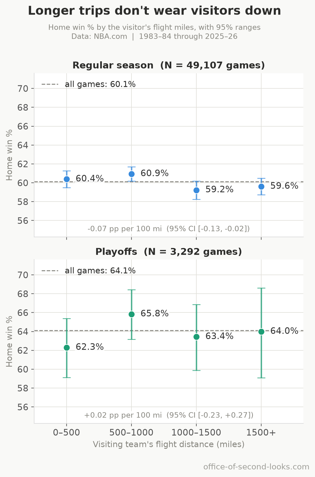
Why the intuition failed. Two reasons. First, home teams travel too. Away teams fly in; home teams flew back from their previous road trip. Better planes benefit both sides, so the relative disadvantage of arriving in a specific building doesn’t shrink just because the flight got more comfortable. Second, the raw travel effect was always smaller than intuition suggests. Even a cross-country trip is worth less than 2 percentage points of home court advantage in the model, against a home edge several times larger. Travel is a real but minor factor, and it hasn’t changed over time in a way that explains the trend.
Rest and Altitude
Why it seemed plausible. Rest should matter: a well-rested team outperforms a fatigued one, and home teams may systematically enter games fresher. Altitude should matter too: Denver and Utah play at elevation, which visibly taxes visiting teams. If either factor grew more prominent over time, it could explain part of the trend.
The test. I categorized each game by which team was better-rested and compared home win rates across categories. In the playoffs I used only series openers: after the first game both teams play on the same nights, so the opener is the only playoff game where their rest can differ. I measured altitude’s effect by isolating Denver and Utah in a model that also includes the long decline and rest.
The result. Rest makes a real difference. Home teams win about 63% of regular-season games when they enter better-rested, and 58% when the visitor has the rest advantage. That 5-point gap is real. Denver and Utah add about 8 percentage points to their regular-season home win rates, the largest of the situational conditions tested here.
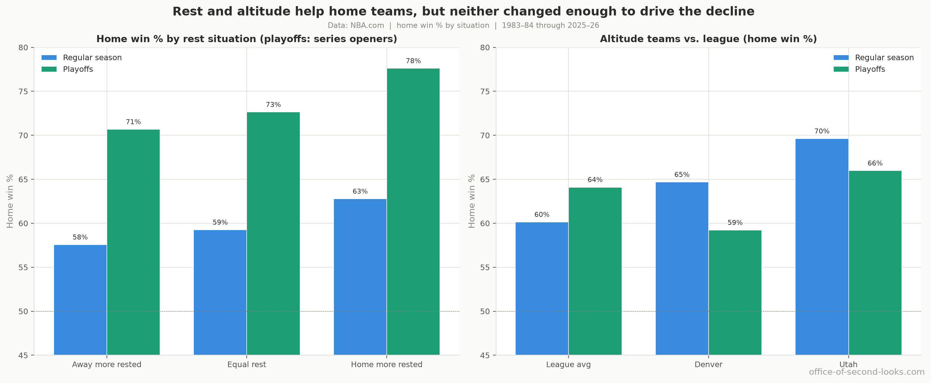
Why neither explains the decline. No period shows a detectable change in the rest gap, and if it moved at all it grew rather than shrank. It existed in the 1980s and it exists now; it did not shrink as home court advantage faded. Altitude’s effect is confined to two franchises and looks to have eased somewhat in recent years, though that shift doesn’t survive the correction for testing it alongside rest and time zones, so treat it as suggestive rather than established; either way it can’t explain a league-wide trend. In the playoffs the worry is that rest stands in for team quality: a team that sweeps a round earns extra days and is probably the stronger side, so the test is whether a rest edge survives separating out the better team. Across the 630 series openers, the playoff rest advantage is about 1.5 points of home win rate per day of rest (95% confidence interval -0.001 to 3.1, p = 0.050), right at the edge of what these games can detect; a version that lets games from the same season move together does not survive the correction for running many tests. Separate out which team had the better regular-season record and about a fifth of it goes, to 1.2 points per day, with a 95% confidence interval from -0.3 to 2.8 that includes no effect at all. Neither factor moved at the scale needed to drive the decline.
Load Management and the Back-to-Back
Why it seemed plausible. This is the most specific and testable version of the rest argument. The NBA scheduling office has been reducing back-to-back games for over a decade. Visiting teams arriving on the second night of a back-to-back were always likely to be fatigued. If fewer tired visitors means fewer easy home wins, the schedule change alone could account for part of the decline.
The test. Split the change into two pieces: measure how home win rates changed within each rest situation (both teams fresh vs. visitor on a back-to-back), then measure how much of the overall trend comes from the mix shifting (fewer back-to-backs) versus the rate changing within each bucket.
The result. The premise is correct: visitor back-to-back frequency fell from about 35% in the 1980s to under 20% today. But the schedule change accounts for only about 0.7 percentage points of the 9-10 point regular-season decline, roughly 8%. The other 92% comes from home court advantage shrinking within every rest situation alike. In games with no back-to-back, home teams win less than they used to. In games with a tired visitor, home teams also win less than they used to. The schedule shift nudged home court advantage; it didn’t drive it down.
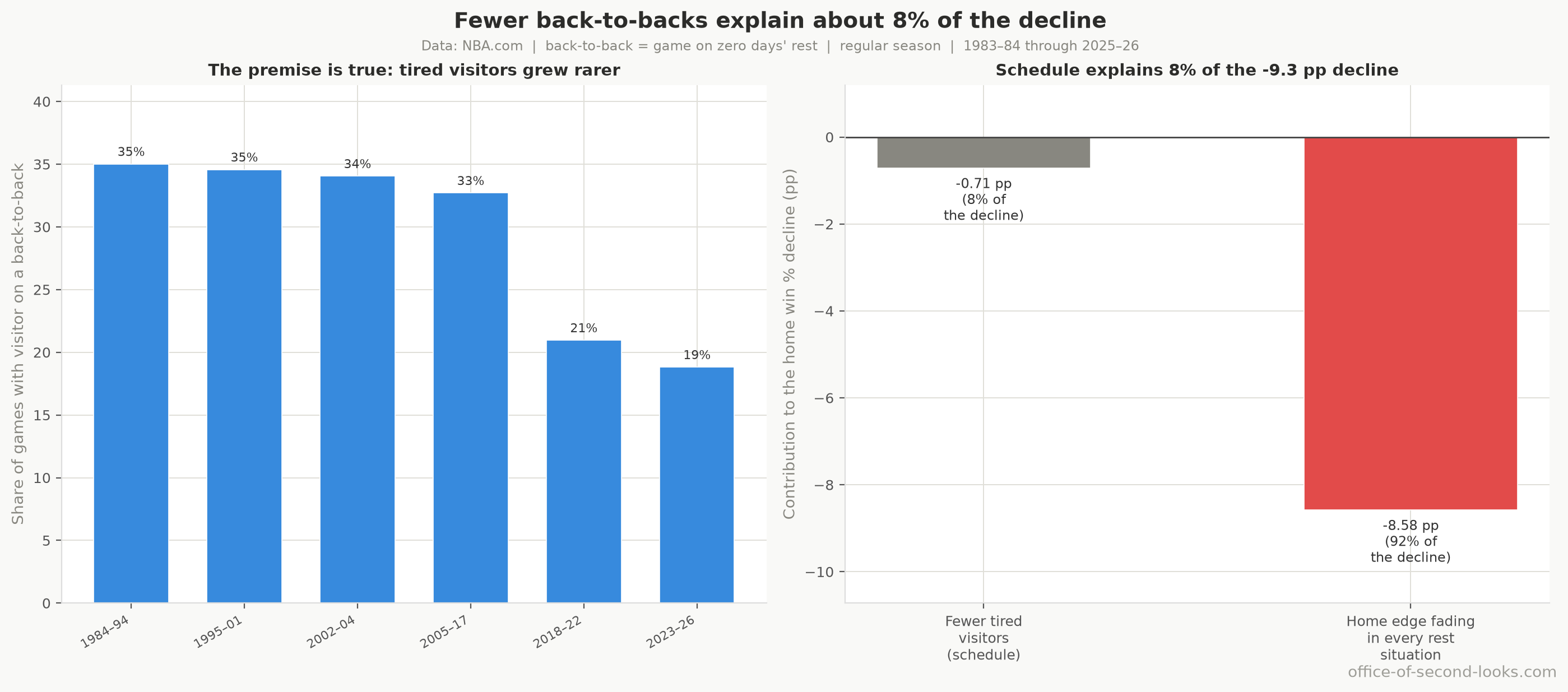
Why the intuition overshot. The home advantage against a tired visitor (about 65%) is only about 5.6 points above the baseline (about 59%). Even a 16-point drop in back-to-back frequency moves the league-wide average by less than a full percentage point. The mechanism is real; the magnitude is just too small to carry the story. The decisive test: if tired visitors were the main driver, you would expect the advantage to hold steady in games with rested visitors and only fall in back-to-back games. The data shows it fell in both.
Pace of Play
Why it seemed plausible. The NBA slowed considerably from the 1980s to the early 2000s, then sped back up after 2015. Either shift could plausibly affect home court advantage. A slower game means fewer possessions for the crowd to swing. A faster game might amplify energy. Either way, the pace swings were large and visible.
The test. Season-by-season plots of pace (possessions per game) against home win rate, plus models comparing games from the same period, for both regular season and playoffs.
The result. No relationship that survives a clean test. Season to season the two barely move together: a weak +0.24 in the regular season and -0.14 in the playoffs, the signs even pointing opposite ways. Pace fell for two decades while home court advantage was falling at its fastest; pace climbed back up after 2015 and the advantage kept falling. The two went the same way, then opposite ways, which is what no relationship looks like. Among games from the same period, faster games do go with the home team winning a touch more, and on tens of thousands of games that link is detectable. Part of it may be the game’s own script: one plausible reason is that a blowout runs up the possession count in garbage time, so a lopsided game can create fast pace rather than the other way around. Judge each game against the pace you would expect before tip-off, which strips out that effect of the score on pace, and the link no longer clears the bar, though it is a near thing. In the playoffs no same-period link is detectable even before that adjustment, and the point estimate runs the other way.
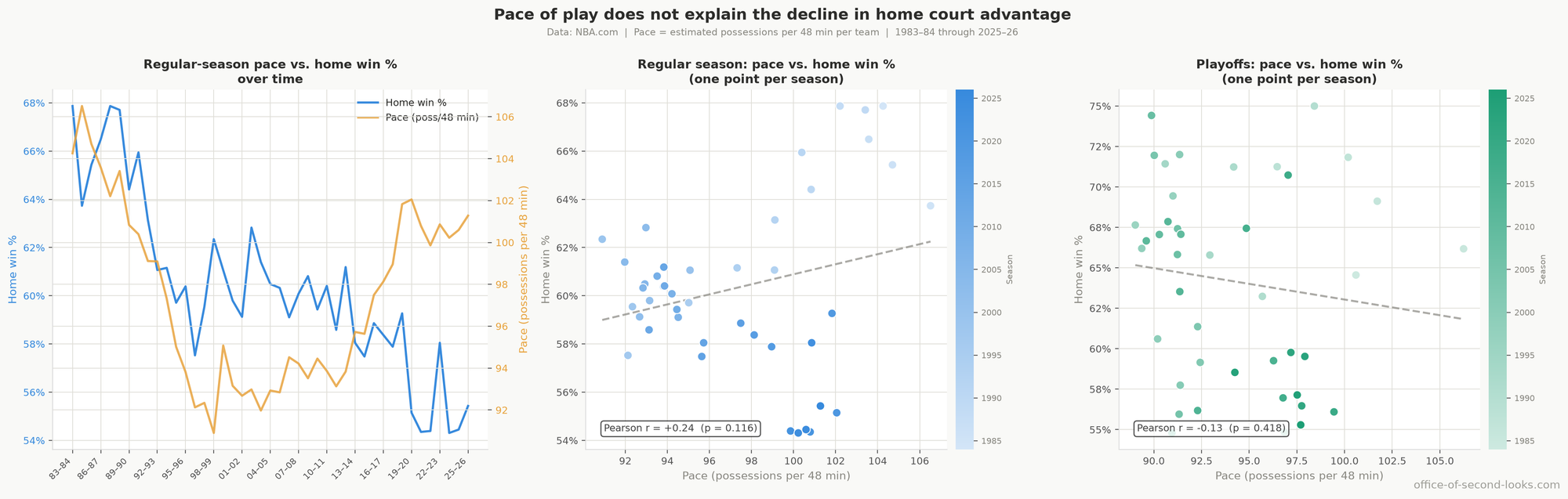
Why the intuition failed. Pace changes the number of opportunities in a game, but it doesn’t systematically advantage one venue over the other. More possessions means more chances for crowd effects to operate, but also more chances for the better-shooting team to assert itself, and more possessions for an efficient away offense to score. The effects run in multiple directions and wash out, leaving no net signal.
Home vs. Away Three-Point Differential
Why it seemed plausible. Part 1 finds that the league-wide shift to three-point shooting goes with lower home court advantage, even among games from the same period. A natural follow-on question: maybe home teams are being outgunned from the perimeter specifically? If away teams now take meaningfully more threes, they might be neutralizing the home crowd effect by operating at distance rather than attacking the basket.
The test. Season-by-season measurement of the home-minus-away three-point attempt rate differential.
The result. Home and away teams have always attempted threes at nearly identical rates. For most of the last 40 years, home teams actually took slightly fewer threes per shot attempt than road teams. Today home teams take about 0.4 percentage points more. The differential is tiny, trends in the wrong direction to explain the decline, and shows no relationship to the home win rate trend.
Why the intuition failed. The three-point story in Part 1 is about both teams taking more threes, not home teams being outgunned. When both teams shift together toward the perimeter, the eFG% gap closes, consistent with threes being taken from spots where crowd and familiarity effects are smaller than on interior attempts. It is a compositional shift that compresses the advantage, not a home-vs-away imbalance.
Competitive Balance
Why it seemed plausible. If the NBA has become more equal, games should be more evenly contested on talent alone. More evenly matched teams should produce more coin-flip outcomes, which would naturally push the home win rate toward 50%. It is a reasonable structural argument.
The test. I measured competitive balance as how spread out team records were each season, and plotted it against home win rate. I then compared the two after stripping the shared long-run trend from both, so a real link doesn’t get invented out of two series drifting the same way.
The result. Parity and home court advantage barely track each other from season to season. The breakdown by period actually contradicts the theory: by the most unequal period (1995-01), home court advantage had already fallen well off its 1980s peak, while in the most balanced period (2002-04) the advantage ticked back up briefly. After removing the shared downtrend from both series, a small year-to-year association does emerge, and it runs the opposite way to the hypothesis: more parity goes with a slightly larger home edge, not a smaller one. It is modest, it rests on a small sample, and nothing here sizes it against the 40-year decline; what rules parity out as the driver is the missing raw link and the period-by-period breakdown above, not this residual.
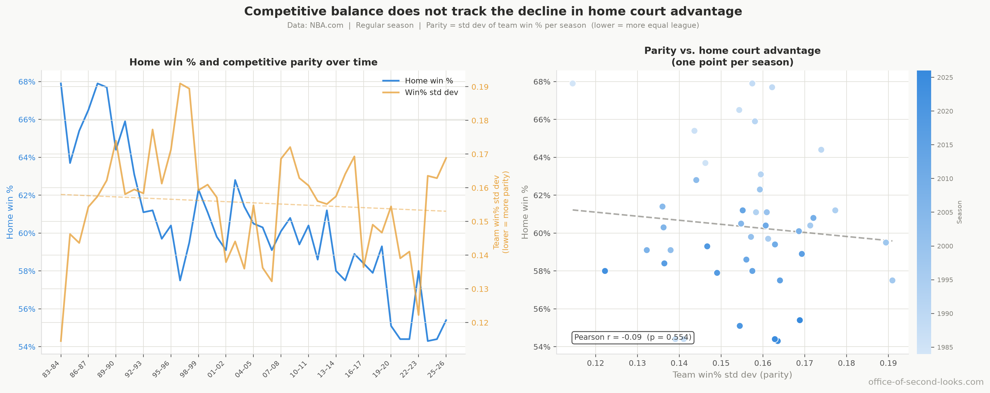
Why the intuition failed. Parity tightens games for both teams alike. More parity means both home and away teams face more evenly matched opponents; it can’t hurt only the home team. If anything, greater parity should make home court advantage more influential, not less, since the teams are closer in talent and venue effects are more likely to be decisive. The structural argument runs the wrong direction.
Crowd Size
Why it seemed plausible. The NBA expanded significantly over this period, adding franchises in smaller markets with younger fan bases. Older arenas in established markets were sometimes loud in ways newer buildings haven’t replicated. If average crowd intensity or size fell, the noise advantage should have weakened.
The test. I plotted league-average attendance per game against home win percentage across the 27 seasons with reliable gate figures.
The result. Outside 2020–21, league attendance stayed within about a tenth of record levels every season, and if anything ran fuller lately: average attendance has climbed past 18,000 a night in recent seasons, the very years home win rates hit their lowest. Season to season, attendance and home court advantage show no consistent link: the different ways of measuring it disagree even on its sign. The playoff case points the same way: postseason games are widely assumed to run near-guaranteed sellouts throughout the record (the attendance series pools regular-season and postseason games rather than separating them, so it cannot isolate a postseason-only average to check that against), yet postseason home court advantage fell across the record too.
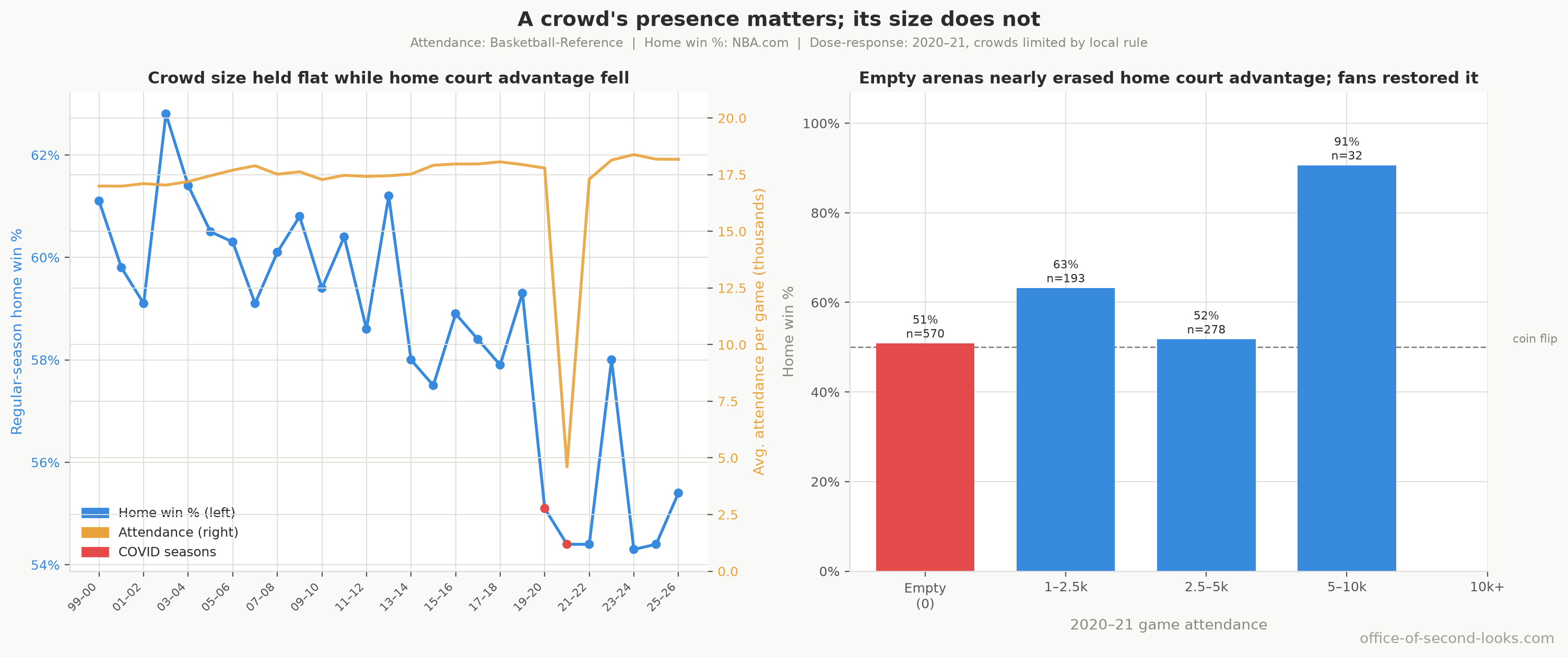
Why the intuition failed. Outside the pandemic, crowd size didn’t fall; how loud or intense crowds are was never measured. Arenas stayed close to their record attendance. If anything, the crowd has been getting bigger in the years home court advantage has been weakest, which is the opposite of what the hypothesis predicts.
The Empty-Arena Comparison
The pandemic supplied a within-season comparison of crowd presence and size. In the 2020–21 regular season, local health rules left some arenas completely empty while others had partial crowds, but crowd exposure also varied with teams, markets, and dates.
The result. In the 2020–21 regular season, with buildings completely empty (570 games), home teams won just 51%, effectively a coin flip. With any crowd at all (503 regular-season games, median attendance 3,120), they won 58.6%. Games with a few thousand fans had a much higher home win rate than games with none. Among games with fans, the data detect no additional link between crowd size and home wins.
This has two implications. First, crowd presence is a plausible ingredient of home court advantage: the regular-season gap is about 7.8 percentage points when you compare completely empty buildings to any crowd at all. Second, these data separate the presence contrast from the crowd-size slope, but cannot establish a binary causal effect because the games were not randomly assigned.
Why shrinking crowds do not explain the 40-year decline. Outside the pandemic, measured attendance stayed near its record while home advantage fell. The pandemic comparison is consistent with crowd presence helping, but it does not isolate its contribution or establish that contribution stayed stable.
The Combined Situational Model
What if it isn’t any single off-court condition, but all of them together? Stack rest, altitude, time zones, and the pandemic’s empty arenas into one model at once, and the decline still stands.
The result. Of the variation in home advantage that the model explains, roughly half belongs to the situational conditions combined. The other half belongs to when the game was played. That part is the decline itself, measured directly. Home advantage is about 9 percentage points lower in 2023-26 than in 1984-94 after every situational condition gets its due, 95% CI 7 to 11 points lower, a band that nowhere comes close to zero.
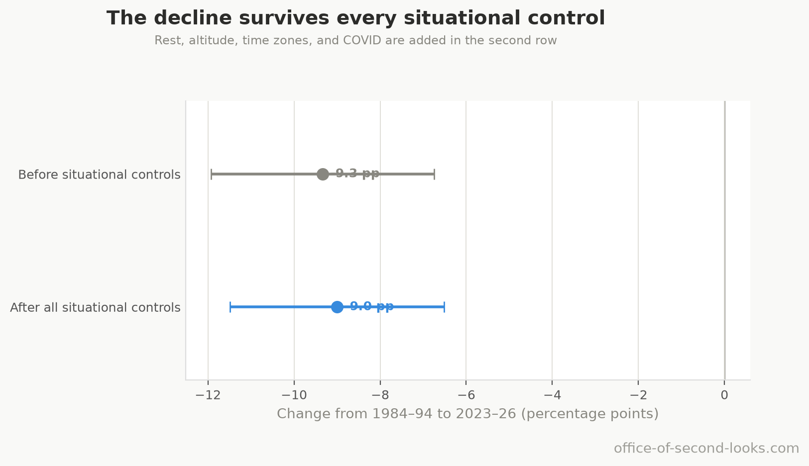
The cleanest version of the test compares seasons on either side of 2014. The size of the rest and time-zone effects is largely stable between the two periods, and altitude’s boost is the one that looks to have eased. None of the three shifts survives correction for the three tested together, so treat each as suggestive rather than established. Yet the baseline home advantage still dropped about 4.7 points. No situational condition’s shift is established; the underlying advantage fell anyway.
What this confirms. By elimination, the decline happens on the court, between two teams on equal footing. What remains once every off-court condition is set aside is the Part 1 story: the fading friendly whistle, the rise in threes, the rebounding collapse, and the fading turnover edge.
Other Findings
Two results sit outside the thesis: neither drives the decline, but both turned up in the same data and are worth recording.
Where Home Court Advantage Still Bites: Altitude and the Buildings
The claim. Home court advantage is not uniform across arenas: some buildings are worth far more than others, and the gaps between them are real, not the luck of a short schedule.
The test. For each franchise I measured its home advantage as its home win rate minus its road win rate, then asked two things: how much of the spread across franchises is genuine once the random bounce of small samples is removed, and which buildings sit at the top. Altitude was isolated by comparing the two elevation franchises, Denver and Utah, against the league in a model that already includes the long decline and rest.
What the data showed. The spread between buildings is mostly real. In the regular season, about 70% of the variation in home advantage across franchises is genuine, not the random bounce of short records, so the ranking is measuring something; in the playoffs, on far fewer games per franchise, the same test finds essentially no true spread at all, so franchises can’t be reliably ranked by their playoff home edge the way they can in the regular season. Denver and Utah sit at the top, worth about 28 and 27 points of home-minus-road advantage before adjusting for small samples (after that adjustment the two sit closer to the field but are still on top), against a league average of about 20 points among qualifying franchises. Altitude is a plausible explanation for the two elevation teams: the model estimates about 8 extra home-win points for them.
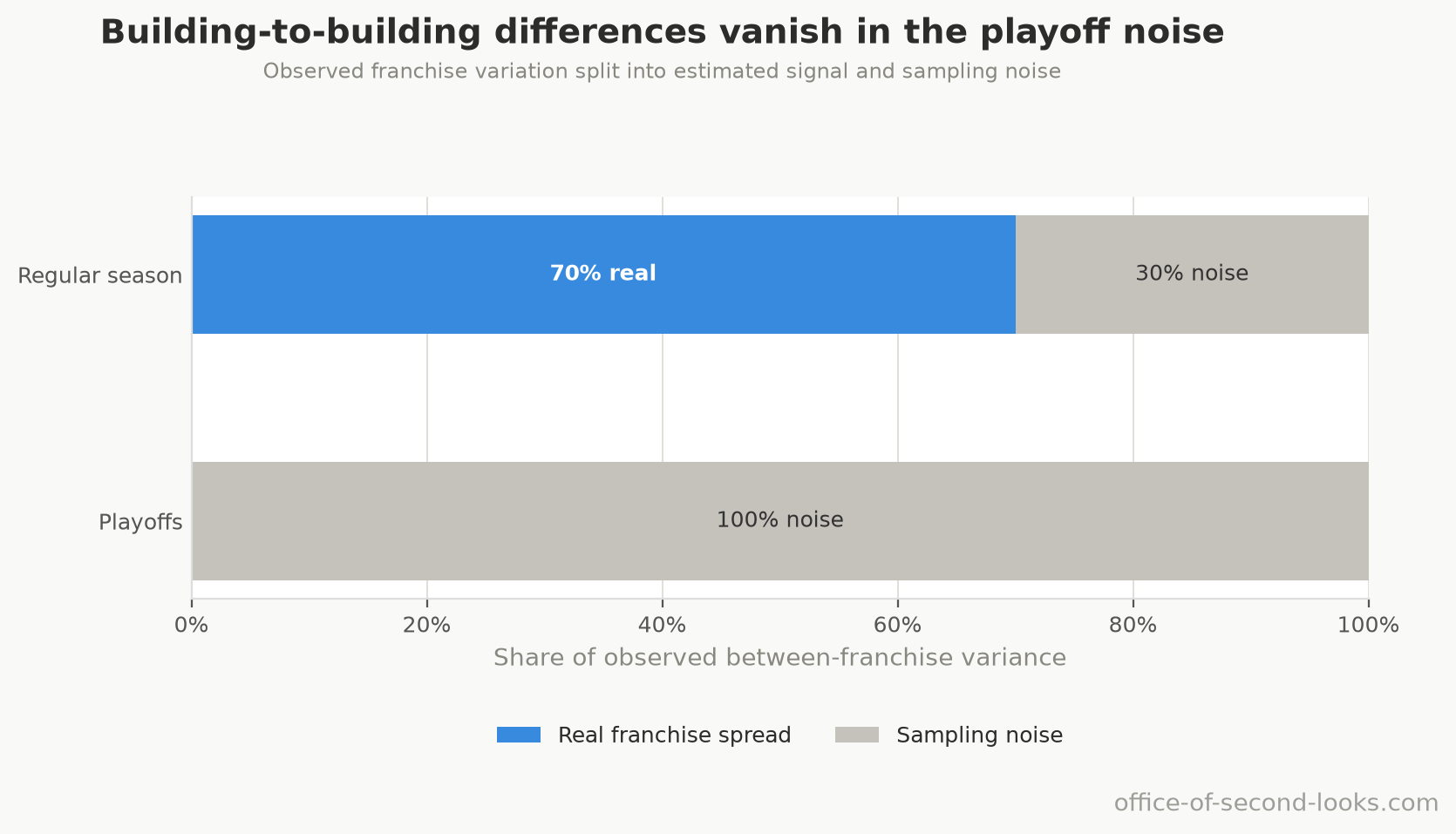
Why it doesn’t reopen the decline. Altitude is confined to two franchises and looks to have eased somewhat in recent years, though that shift is suggestive rather than established, so it can’t drive a league-wide slide either way (that is why it appears in Part 2 as a ruled-out cause of the decline). And the decline is shared: every long-record franchise’s home edge fell at essentially the same rate (Part 1), even though they started from different heights. This finding is about how big the advantage is in each building, not the trend, which is why it lives here rather than in either Part.
Fewer Home Wins, Bigger Blowouts
The claim. As home teams win less often, the games they do win have grown more lopsided, and so have the ones they lose.
The test. Measuring the home team’s winning margins and losing margins separately can’t settle this, because it carries a built-in trap: as home wins get rarer, the near-tie games flip from narrow wins into narrow losses, which drags those two averages apart on its own, without anything about the games changing. So the test ignores who won. I tracked the full spread of home-team point margins, the gap between the biggest wins and the biggest losses (the 90th minus the 10th percentile), fit a separate trend line through each end, and measured how fast the two ends pull apart, regular season and playoffs separately, over the seasons 1996–97 through 2025–26. The range on each figure comes from re-running the whole fit on re-drawn samples, whole seasons at a time.
What the data showed. The spread widens by about 0.23 points per year in the regular season, 95% CI [0.15, 0.31], and about 0.35 per year in the playoffs, 95% CI [0.23, 0.47]. Both bands stay above zero, so the widening is real in both, not a chance wobble. Blowouts grow in both directions: the biggest home wins get bigger and the biggest home losses get worse, and that holds in the regular season and the postseason alike. Both playoff ends move a long way: the biggest home wins trend at +0.233 points a year, 95% CI [+0.135, +0.331], p < 0.001, and the biggest home losses at -0.119, 95% CI [-0.215, -0.024], p = 0.019. Those two p-values are already adjusted for the fact that this test fits five points of the margin range in each of the two contexts, ten in all, so a reader does not have to discount them for the size of the sweep. The top end has the larger point estimate. The two intervals overlap, and no direct test of the difference between the tails was run.
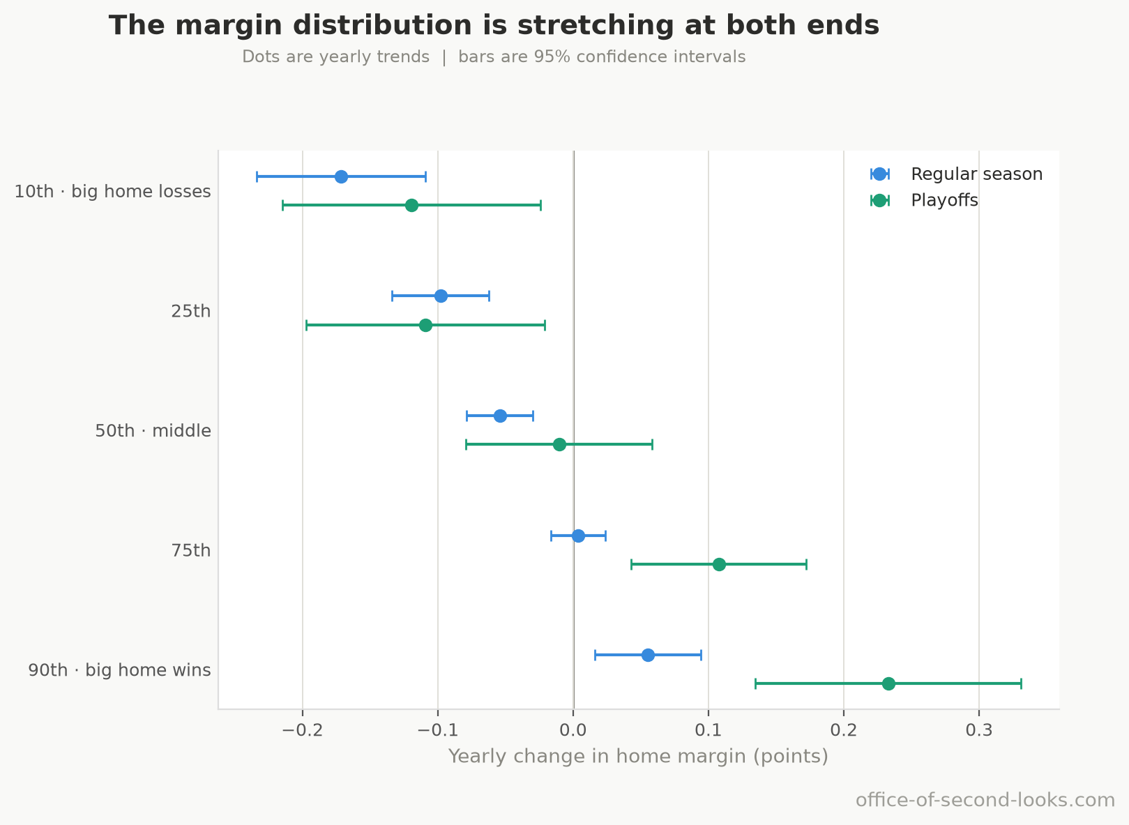
This test was rebuilt after an earlier version of it proved unreliable, and that history is worth a line. Fitting a trend through a percentile of a whole-number quantity is harder than it looks, and it went wrong twice over: margins land on 6 points or 7 and never in between, which leaves the thing being measured only loosely pinned down, and the software doing the fitting was cutting a corner besides. On a sample the size of the postseason, that was enough to decide the answer: rebuilding the numeric libraries at identical versions moved the playoff result, which meant it was reporting the software rather than the games. That is fixed rather than papered over, and the playoff figures above come from the rebuilt test, which now returns the same answer down to the last digit even when the underlying math libraries are swapped out for a different implementation entirely.
Which seasons this describes. The primary margin fits retain 1996–97 through 2025–26, the seasons the original analysis used. The full study covers 1983–84 through 2025–26, and the longer window contains the shorter one rather than naming a separate period. Reconstructing margins from the two teams’ scores makes the earlier seasons usable, but correcting a score and widening a window are different changes, so the longer window is reported here as a sensitivity and the fits above stay the primary result. Over the full window the regular-season biggest-home-win trend is -0.009 points a year, 95% CI [-0.038, +0.021], a range that covers zero, against +0.055 over the primary window with its whole range above zero. So the rise the shorter window detects is not detected over the longer one, which is not the same as finding that it reverses. In the playoffs both ends still move over the full window, the biggest home wins at +0.107 a year and the biggest home losses at -0.134, and the point estimates put the larger movement at the losing end where the shorter window puts it at the winning end. The intervals for the two tails overlap in each window, and no direct test of their difference was run. No direct test of the difference between the two windows was run either; such a test would need to account for the seasons they share. The full-window spread increases by 0.12 points per year in the regular season and 0.24 in the playoffs.
Why it doesn’t contradict the decline. Fewer home wins overall, and home games more lopsided in both directions: the ends of the range moved much further than the middle did: the typical home margin slips by only -0.054 points a year while the gap between the extremes widens by 0.23. It sits alongside the decline rather than explaining it: the win rate fell while the two ends of the margin range pulled apart.
How this was made: the writing here is mostly AI/LLMs working from my analysis and direction; the numbers are all Python on public NBA data. Every claim is backed up by data. The data, analysis, and conclusions are trustworthy. The full note is on the series hub.