Skip to content
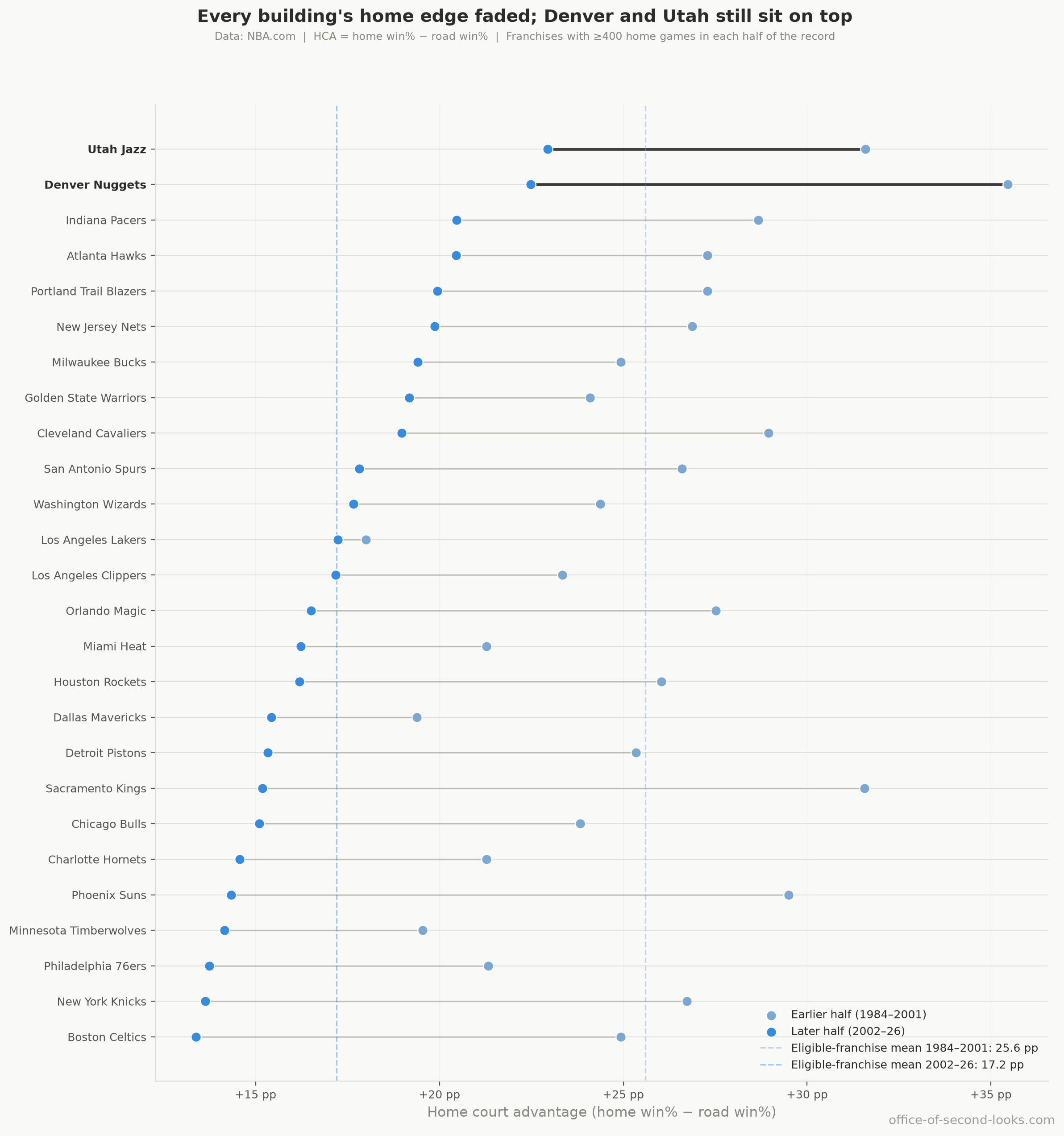
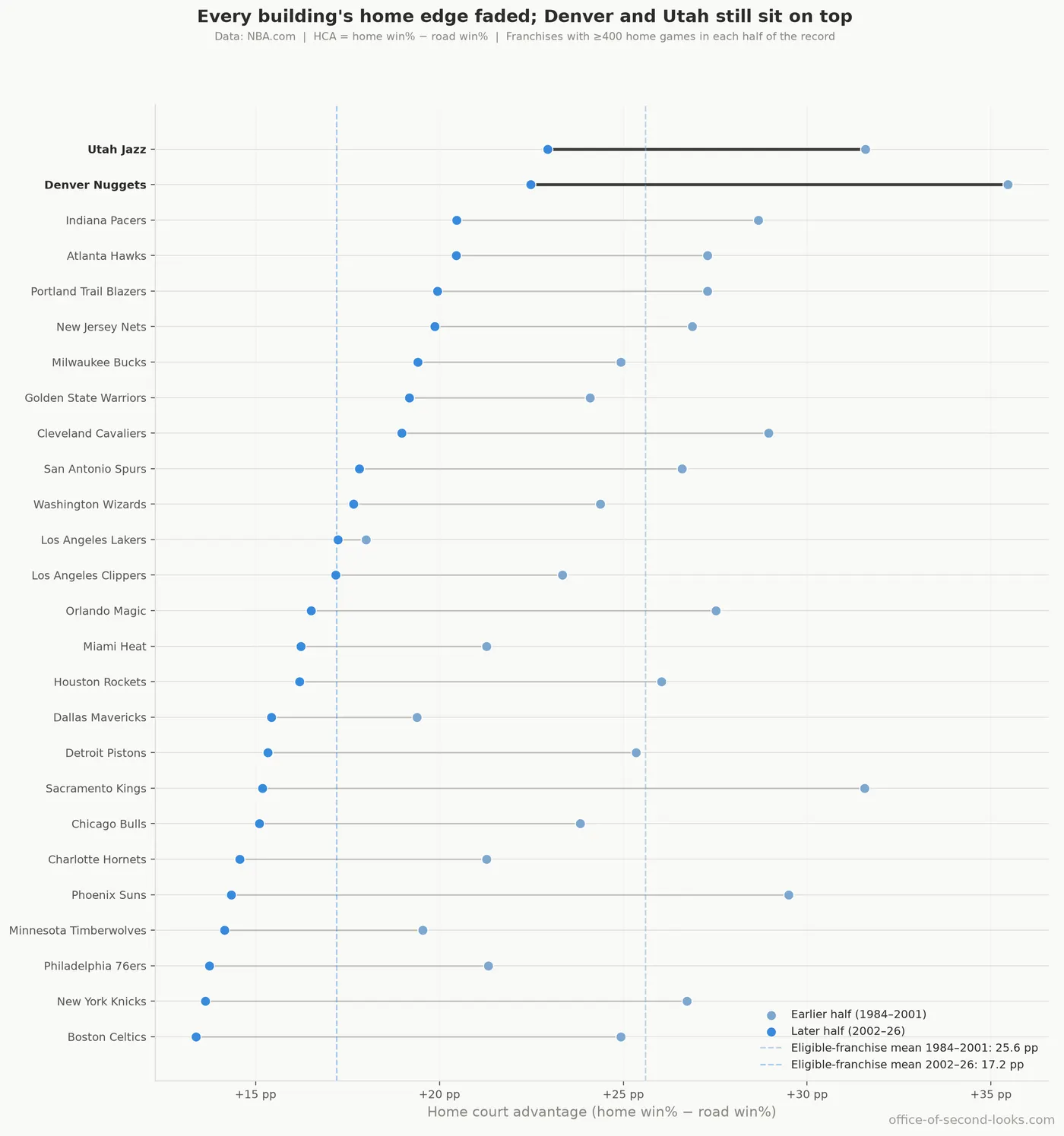
Each franchise’s regular-season home edge in the early era (1984–2001, light blue) and the recent era (2002–26, darker blue), sorted by where they stand today. Denver and Utah (bold) still…

Part 7 of a series on the NBA’s fading home-court advantage; start with Home Court Advantage Is Fading.

Home-court advantage in the NBA has been fading for forty years; two buildings never got the memo. Denver and Utah, the league’s only altitude teams, still hold its largest regular-season home-court advantages: on the noise-adjusted ranking that removes the random bounce of a short schedule, about 26.8 and 25.7 percentage points above their own road win rates, against a league average near 20. The chart below splits that record into an early and a recent era, where every number sits lower and those two are still the top of the field. The thin mountain air is the most plausible reason, and it has outlasted four decades of decline.

Each franchise’s regular-season home edge in the early era (1984–2001, light blue) and the recent era (2002–26, darker blue), sorted by where they stand today. Denver and Utah (bold) still sit on top, and the trail behind each franchise shows how far it fell as the whole field shifted left. Dashed lines mark the league average in each era.

That slide is real and league-wide. But it did not flatten every franchise to the same level, and a few of the differences between buildings are worth a look on their own, alongside one league-wide habit the home floor kept: the blowouts got bigger even as the wins got scarcer.

The spread between franchises is real

Denver and Utah play at altitude, and the franchise spread they sit on top of is not just noise: roughly 70% of the variation across teams reflects genuine differences between franchises, not the random bounce of a short home schedule. Altitude sits right at the top of that spread. With only two high-altitude franchises, elevation can’t be fully separated from whatever else is unique to those teams, but it is the most plausible common thread. Denver and Utah’s home games run about 8 points above the league’s baseline home win rate, a bigger effect than rest, travel or time zones. That is a different way of sizing the edge than the home-minus-road gap above, and with only two altitude teams their own strength can’t be separated from the elevation.

There’s a reason the chart at the top splits the two eras instead of showing one all-time number. Rank every franchise by its home edge averaged across all forty years, and the names just beneath Denver and Utah give the trick away: the Washington Bullets, the Seattle SuperSonics, the Kansas City Kings, and the New Jersey Nets, none of them still playing under those names. Each one’s record closes during the high-advantage decades, the Bullets in 1997, the Sonics in 2008, the Kings’ Kansas City years in 1985, the Nets’ New Jersey era in 2012, so its average never absorbed the recent lows that pulled the rest of the league down. For three of those four the proof is on that same ranking: the teams that carried the Bullets’, Sonics’, and Nets’ records forward, the Wizards, the Thunder, and the Brooklyn Nets, all sit in its bottom half. Denver and Utah are the exception: their records run through every one of those low years, and they are still on top.

📊 The all-time ranking those ghosts sit near the top of: regular-season home court…
The all-time ranking those ghosts sit near the top of: regular-season home court advantage by franchise, averaged over each franchise’s whole record, with a range on each bar showing how much it could shift on the games available. Because a forty-year average mixes eras, franchises whose records ended early (the Bullets, SuperSonics, Kansas City Kings, and New Jersey Nets) rank higher than teams whose record ran into the recent low-advantage years.
📊 Each franchise’s regular-season home edge (across) against its playoff home edge (up),…
Each franchise’s regular-season home edge (across) against its playoff home edge (up), with the range on each. The playoff ranges are tall enough to overlap, so franchises can’t be reliably ranked on playoff home court the way they can in the regular season: the postseason order is mostly the random bounce of a short schedule.

Every building faded, from different heights

The chart at the top shows the shape of it: every franchise fell, each from a different height. How far they fell varies widely, though, inflated by small samples and by how high each one started. Split the 40-year record at 2001–02 and the league average dropped from about 25.6 percentage points to about 17. Every one of the 26 franchises with at least 400 home games in both halves declined. Sacramento and Phoenix fell the most, about 16 and 15 points; both sat near the top of the league in the 1980s and 1990s and are in the bottom third now. The Knicks shed 13 points. At the other end, the Los Angeles Lakers barely moved (a drop of under a point): they started well below the league average and now sit right at it, since the league average fell so much further. Denver and Utah both declined a lot too (13 and 9 points), yet still sit at the top of the recent rankings. Read the ranking of those drops loosely, though: a franchise that started high and drifted down toward a falling league average posts a big raw drop even if nothing about its building changed, and small samples exaggerate the extremes. Once that random bounce is removed, the true team-to-team difference in decline rates is about zero, which The Usual Suspects works out in full; here the point is only that the franchises started from different heights.

In the playoffs, the buildings look alike

All of that is the regular season. The postseason erases it. With fewer than 150 playoff home games on record for most franchises, the apparent gaps between them just reflect how few games each has played; the real spread is too small to separate from the random bounce. Once that bounce is removed, the true spread between playoff franchises is essentially zero.

The twist is that the shared advantage every team has is bigger in the playoffs than in the regular season. Averaged across franchises with both records, home court is worth about 20 percentage points in the regular season and about 27 in the playoffs, a 7-point premium. Some of that gap is seeding, since better teams host more playoff games; how much of the premium survives once that is stripped out isn’t measured here. Why the rest exists is a guess this data can’t confirm: the crowd, the stakes, and the familiar floor are all plausible candidates, and none of them was tested.

Fewer home wins, bigger blowouts

Home floors kept one other kind of bite, and this one is league-wide rather than a property of any building: even where the wins faded, the punishments grew. As home teams win less often, the games they do win have grown more lopsided, and so have the ones they lose. Track the full spread of margins regardless of who won, over the seasons with per-game margin data (1997 on), and the gap between the biggest wins and biggest losses widens by about 0.23 points per year in the regular season and 0.35 in the playoffs. Blowouts grow in both directions, in the regular season and the playoffs alike: the big home wins get bigger, and the big home losses get worse, though the regular season’s widening is mostly on the losing end, and in the playoffs the bigger movement is on the winning end, by too little to call on that many games. Fewer home wins overall, but the ones that happen land harder.

📊 Three panels. Left: mean all-game point margin per season for regular season and…
Three panels. Left: mean all-game point margin per season for regular season and playoffs. Center: mean win margin and mean loss margin per season (regular season); the two lines diverging means the average home win is getting bigger while the average home loss is getting worse. Right: the same by era.

Home court advantage faded in every building, these two included. But in Denver and Utah, and in the widening margins of a home blowout, the building still bites.


Next: How I Know This Isn’t Made Up. Every finding in this series was run through a battery of tests built specifically to break it; here’s what survived.

Back to the series hub: The Disappearing Home-Court Advantage

How this was made: the writing here is mostly AI/LLMs working from my analysis and direction; the numbers are all Python on public NBA data. Every claim is backed up by data. The data, analysis, and conclusions are trustworthy. The full note is on the series hub.

Data: NBA.com Stats, pulled with the open-source nba_api tool; attendance records from Basketball-Reference.


Comments